How-to
How to build a Google Slides stacked bar chart with ChartKit
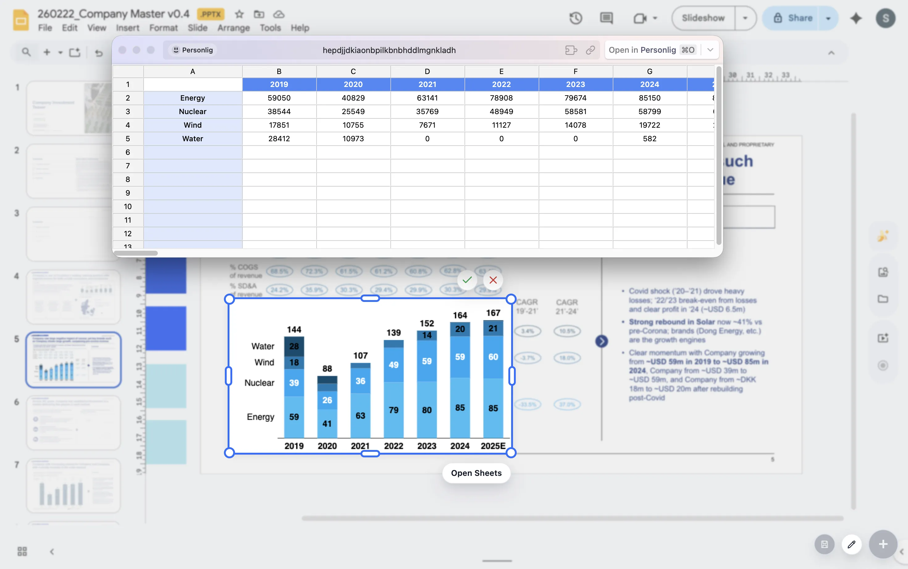
Stacked bars are useful when you need to show both total size and composition at the same time. When the composition is the only point, switch to a 100% bar so the audience compares mix rather than absolute scale.
Choose the right variant
Use a stacked bar when
You need to compare both the total and the contribution of each segment across categories.
Use a 100% bar when
You want the audience to compare mix, share, or allocation while removing differences in total size.
Build steps
- Start with categories that answer a single clean comparison question.
- Keep segment order consistent across every bar so the eye does not have to relearn the encoding.
- Use labels selectively on the segments or totals that matter most to the story.
- Adjust spacing and colors so the chart reads clearly on a slide, not just in a spreadsheet cell.
Checklist
Consistent segment order
Keep segment order identical from bar to bar so the audience can compare patterns quickly without relearning the encoding.
Totals when scale matters
If total size is part of the story, show totals or labels that make the whole stack easy to compare.
100% bars when mix matters
Normalize the bars when composition is the story so the audience compares shares instead of being distracted by differences in scale.
Presentation advice
If one segment is the real punchline, call it out. If the story is about the whole stack, show totals. If the story is about mix, remove any visual noise that competes with the shares.
FAQ
Common stacked-bar questions.
How do I choose between a stacked bar and a 100% bar?
Use a stacked bar when both total size and segment contribution matter. Use a 100% bar when the point is mix, share, or allocation across categories.
What usually makes stacked bars hard to read on slides?
Inconsistent segment order, too many small slices, and labels on every segment are the most common problems. Reduce noise and emphasize the elements that support the takeaway.
What should I compare this with?
Compare this guide with the waterfall guide if your story is about change between totals rather than composition within totals.