How-to
100% stacked bar chart in Google Slides
A 100% stacked bar chart is useful when every category should be compared on mix. It removes total size from the visual so the audience can focus on share.
Quick answer
Use a 100% stacked bar when the question is about composition. Keep segment order consistent, avoid too many small slices, and label only the shares that matter to the point.
When to use it
Use 100% bars when mix matters more than scale
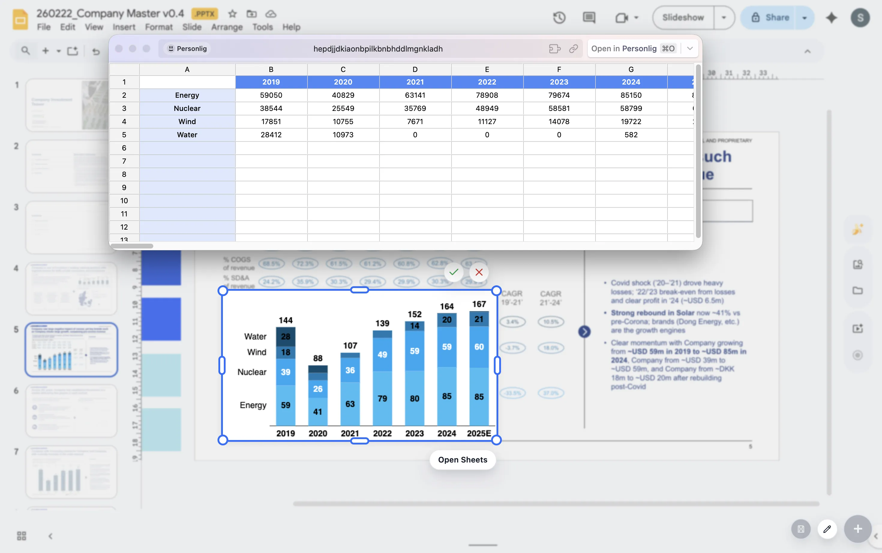
A normal stacked bar shows both total size and contribution. A 100% stacked bar normalizes every bar to the same length, which means the audience compares percentage mix instead of absolute value.
This is useful for revenue mix by segment, cost allocation by department, product share by region, or channel mix by period. If total size is part of the decision, use a regular stacked bar instead.
Design choices
Three rules make 100% bars easier to read
Keep order stable
Use the same segment order in every bar so the viewer can compare patterns without relearning the stack.
Limit segments
Too many categories create thin slices. Group small segments when they do not matter to the story.
Label selectively
Label the largest shifts, the key segment, or the total mix that supports the slide headline.
Lead magnet
Stacked vs 100% stacked decision guide
Use this decision guide before choosing between a regular stacked bar and a 100% stacked bar.
- Use a stacked bar when total size and segment contribution both matter.
- Use a 100% stacked bar when mix, share, or allocation is the main point.
- Avoid 100% bars when the audience also needs to compare total volume.
- Switch to a simpler bar chart if one segment is the only story.
Choose the right variant before polishing the slide
ChartKit lets you build presentation-ready stacked and 100% bars directly inside Google Workspace.
Where ChartKit fits
Build the chart around the comparison you want the audience to make
ChartKit supports stacked bars and 100% bars for Google Workspace teams. That makes it easier to choose the right variant while staying in the deck workflow.
In other words, you can adjust the chart for the story instead of accepting the first spreadsheet default that appears.
FAQ
Common questions about 100% stacked bars
When should I avoid a 100% stacked bar?
Avoid it when total size is important. Since every bar has the same length, differences in total volume disappear.
How many segments should a 100% stacked bar have?
Fewer is better. Three to five segments are usually easier to read than a long stack of small categories.
Can I build 100% stacked bars with ChartKit?
Yes. ChartKit supports stacked bars and 100% bars for teams building charts in Google Workspace.