Finance charts
Variance analysis charts in Google Slides
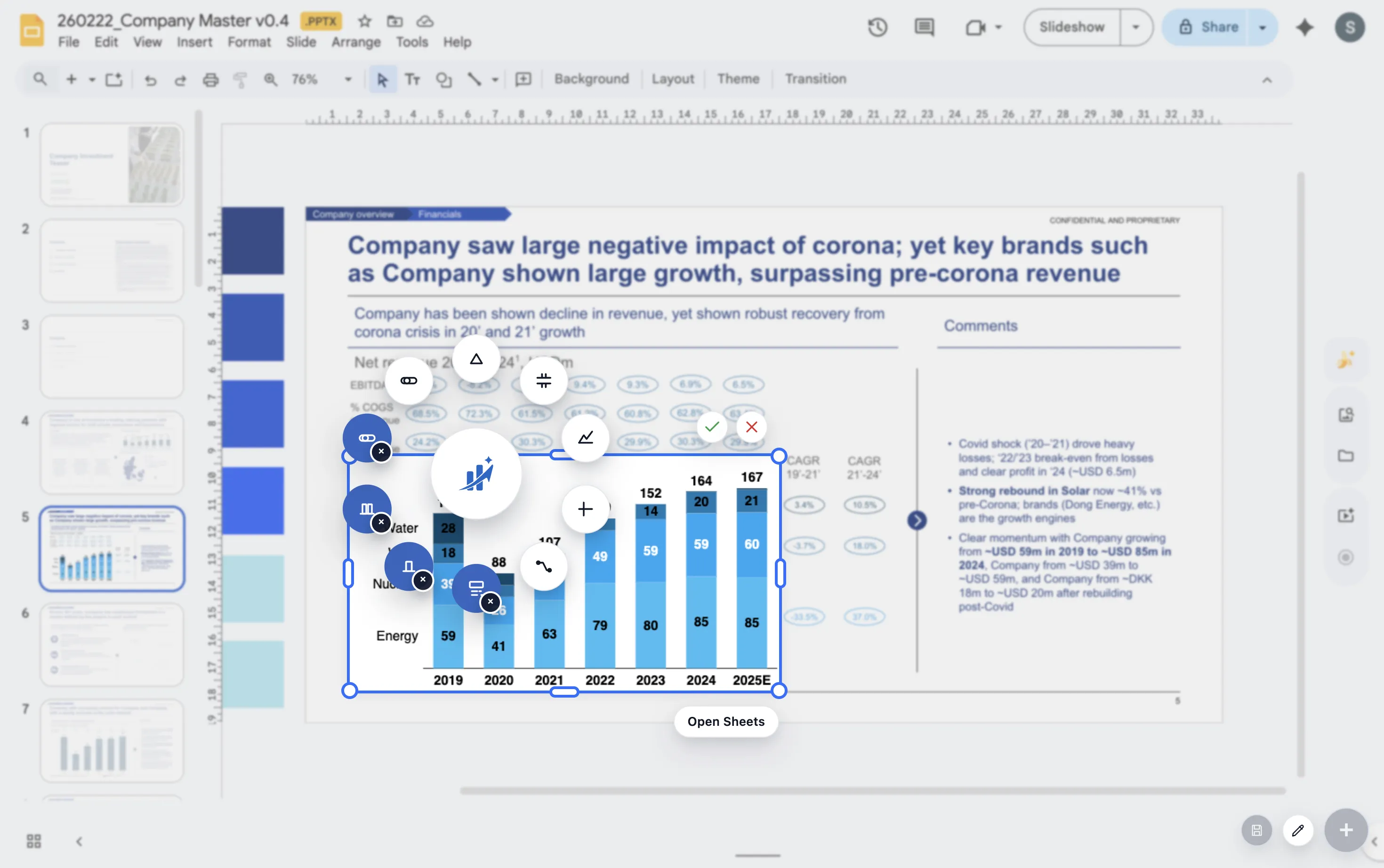
A variance analysis chart is useful when the audience needs to understand why actual performance differs from plan, forecast, or prior period.
Quick answer
Use a variance chart when the story is about a gap. Show the reference point, show actual performance, then explain the drivers that created the difference.
Finance use case
Variance analysis should separate size from cause
A plan-versus-actual bar can show the size of the gap. It does not explain the cause. For many finance discussions, the cause is the important part.
That is why variance analysis often pairs a simple comparison with a waterfall or bridge. The comparison shows the gap, while the bridge explains the drivers.
Variance views
Three views help explain variance
Plan versus actual
Use this view to show the gap clearly before explaining it.
Driver bridge
Use a waterfall to show the factors that created the variance.
Trend context
Use a line chart when the team needs to know whether the gap is new or persistent.
Lead magnet
Variance chart checklist
Use this checklist before adding a variance chart to a finance presentation.
- Is the reference point clear, such as plan, forecast, or prior year?
- Does the chart show both the size and the cause of the gap?
- Are the largest drivers labeled without over-labeling small items?
- Does the chart end with the decision or action the gap requires?
Explain the gap without rebuilding the slide
ChartKit helps finance teams build variance and bridge charts directly inside Google Workspace.
Where ChartKit fits
Build variance explanations as presentation charts
ChartKit helps teams build waterfall charts, bars, and line charts in Google Workspace. Those chart types cover the common parts of variance analysis.
The benefit is strongest when the same variance view appears in monthly reports and needs to stay consistent across cycles.
FAQ
Common questions about variance charts
What chart is best for variance analysis?
Use a bar chart to show the gap and a waterfall chart to explain the drivers behind the gap.
Should positive and negative variances use different colors?
Often yes. Color can help, but keep the palette consistent and avoid making every small variance visually loud.
What should the title say?
The title should state the business takeaway, such as Gross margin missed plan due to freight and discounting.