Chart choice
How to choose the right chart type for an executive presentation
Choosing a chart type is a communication decision. The right chart is the one that answers the executive question with the least effort from the audience.
Quick answer
Use bars for comparison, lines for movement over time, waterfalls for drivers between totals, and stacked bars for mix plus size. If the chart type does not match the question, better formatting will not save it.
Decision first
Start with the question, not the data format
Executives usually want to know what changed, why it changed, whether performance is on track, or what decision needs to be made. Those questions point to different chart types.
If you start from the spreadsheet layout, you often end up with a chart that matches the source data but not the meeting. Start with the question instead.
Chart mapping
Match each question to a chart family
Compare categories
Use a bar chart when the main question is which category is larger or smaller.
Explain change
Use a waterfall when the audience needs to understand drivers from one total to another.
Show mix
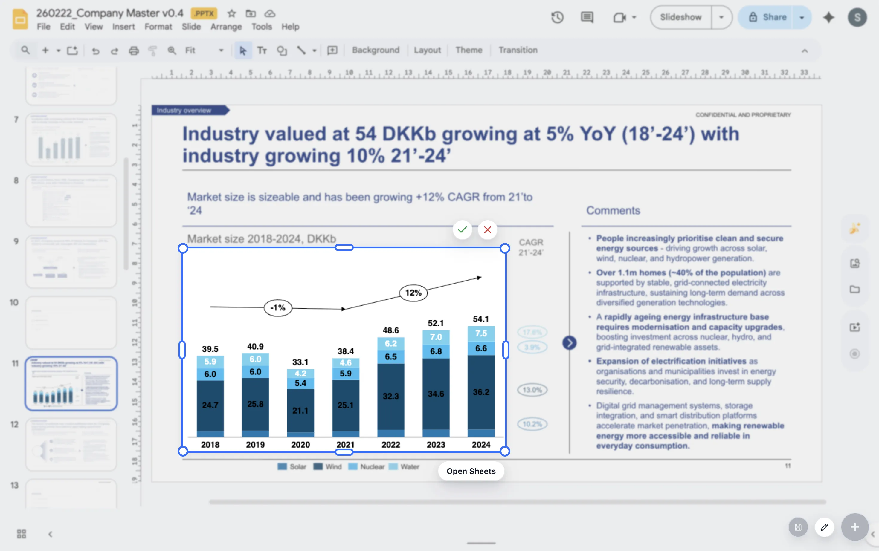
Use stacked or 100% stacked bars when composition is part of the story.
Lead magnet
Executive chart type decision tree
Use this short decision tree when choosing a chart for an executive slide.
- If the question is about ranking, use a bar chart.
- If the question is about time, use a line chart.
- If the question is about drivers between totals, use a waterfall.
- If the question is about composition, use a stacked or 100% stacked bar.
Build the right chart type inside Google Slides
ChartKit keeps the chart choice, data, and presentation polish in one Google Workspace workflow.
Where ChartKit fits
Use a focused chart set for recurring executive decks
ChartKit focuses on the chart types teams use repeatedly in Google Workspace, including bars, stacked bars, 100% bars, line charts, and waterfalls.
That focus is helpful for executive presentations because most recurring business questions can be answered with a small set of well-built chart patterns.
FAQ
Common questions about chart type selection
What is the safest chart type for executives?
A simple bar chart is often safest for category comparisons. The best choice still depends on the question.
When should I avoid pie charts?
Avoid pie charts when there are many segments or small differences. A bar chart is usually easier to compare.
Should executive charts be simpler than analyst charts?
Usually yes. Executive charts should reduce the decision down to the pattern or driver that matters most.