Storytelling
How to label charts for executive decks
Chart labels can make an executive slide clearer, but they can also turn the chart into visual noise. The difference is restraint.
Quick answer
Label the values that support the main point. Use totals when scale matters, end labels when trends matter, and selective segment labels when mix matters. Avoid labeling every value by default.
Labeling principle
Labels should reduce effort for the audience
The audience should not have to hunt for the important number. A good label makes that number easy to find. A bad label forces every number to compete for attention.
Start with the slide headline. Then label the value, total, or movement that proves the headline. Everything else can often stay unlabeled.
Label choices
Three label types cover most executive charts
Total labels
Use them when the whole stack, category, or period total matters.
End labels
Use them on line charts so the audience does not have to bounce between line and legend.
Delta labels
Use them when the change is more important than either endpoint alone.
Lead magnet
Executive chart labeling checklist
Use this checklist before finalizing chart labels in an executive deck.
- Does each label support the slide headline?
- Can any labels be removed without reducing understanding?
- Are totals shown where total size matters?
- Are labels large enough to read in presentation mode?
Label charts where the slide is built
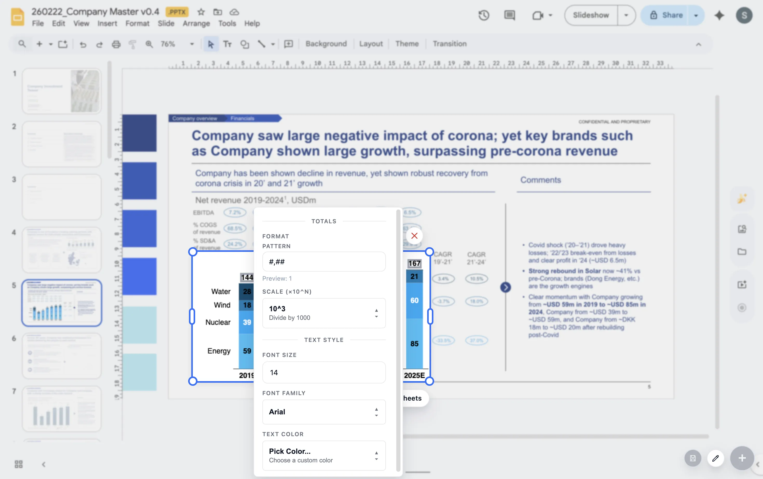
ChartKit helps teams refine labels, totals, and deltas inside Google Workspace.
Where ChartKit fits
Use labels as part of the chart storytelling workflow
ChartKit includes controls for labels, totals, deltas, and annotations in Google Workspace charts. That helps teams decide what to emphasize while building the chart in the slide context.
The goal is not more labels. The goal is better guidance for the reader.
FAQ
Common questions about chart labels
Should every bar have a label?
Not always. Label the bars that matter to the point. If every label is useful, make sure the chart still has enough spacing.
Are legends better than direct labels?
Direct labels often reduce effort, especially on line charts. Legends can work when the chart has enough space and few series.
What is the biggest labeling mistake?
The biggest mistake is labeling everything and making the important values harder to find.