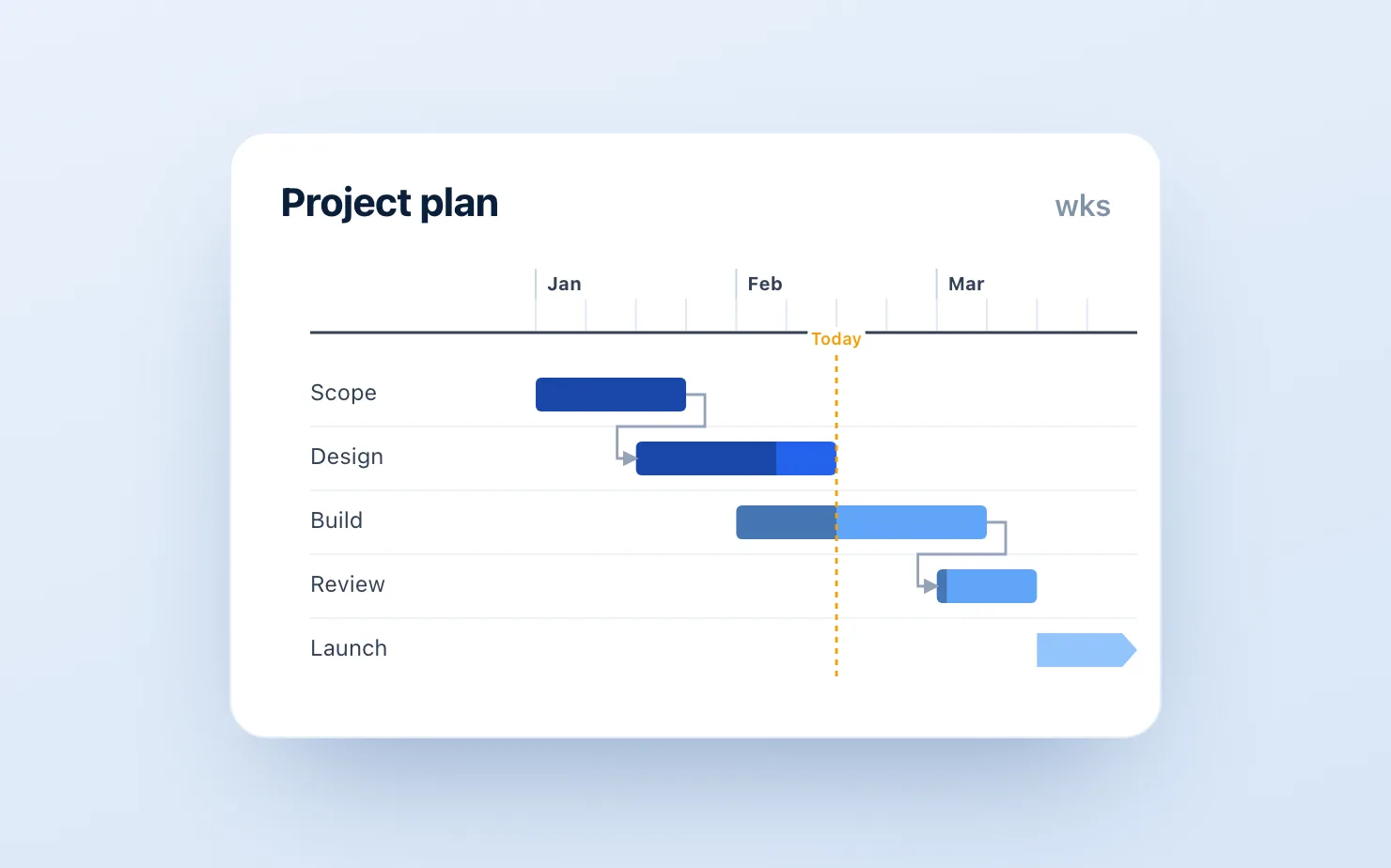
Every roadmap deck has one: the timeline slide. Workstreams down the left, months across the top, bars showing who's doing what when. In PowerPoint with think-cell, this is a two-minute job with automatic date scaling. In Google Slides, it's a pile of hand-drawn rectangles that shifts out of alignment every time someone adds a row.
And roadmap slides get edited more than any other slide in the deck. Product reviews go through ten rounds; every round breaks the layout.
Here are the real options, honestly assessed — including the fact that ChartKit does not have a Gantt chart today. So unusually for a vendor blog, this article will mostly recommend other things. We'll explain at the end where ChartKit fits in a roadmap deck anyway.
Option 1: Hand-drawn shapes (free, fragile)
The default: draw rectangles on a table grid, align them by eye, label them with text boxes.
If you do this, three rules make it survivable:
- Build on a table, not on guides. Insert a real table for the month columns and workstream rows, set borders to a light grey, and snap bars to cell edges. When a row is added, the table moves everything together.
- Use exactly one bar height and two colors. Visual noise is what makes hand-drawn Gantts look amateur. One height, one color for committed work, one lighter tint for tentative.
- Group each workstream's bar + label. When the layout shifts, you move one object, not three.
Even done well, this takes 30–60 minutes and degrades with every edit. Fine for a one-off; painful for a living roadmap.
Option 2: Templates (free–cheap, faster start, same fragility)
Template sites (Slidesgo, SlidesCarnival, and the template packs in this niche) offer pre-built timeline layouts. They solve the first 30 minutes — the grid is drawn, the styling is decent — but not the maintenance problem. Dates aren't data; they're rectangles. Shifting a milestone by three weeks means nudging shapes and hoping.
Worth using if your timeline changes rarely. The moment it becomes a recurring slide, you're back in option 1's maintenance loop.
Option 3: A Gantt add-on (paid, the real fix for heavy users)
If roadmap slides are a weekly part of your job, you want bars driven by dates, not by pixel-nudging.
ChartBuddy (~€10/mo) is the main native option: a real Gantt chart type inside Google Slides where bars are generated from start/end dates and re-render when dates change. It's the closest thing to the think-cell Gantt experience in Google Workspace today, and for this specific chart type it's the tool we'd point you to. For every other chart in the deck, our think-cell alternative comparison breaks down where each option wins.
Lucidchart also builds timeline diagrams that embed in Slides, better suited to milestone-style program views than dense multi-workstream Gantts.
TeamGantt / project tools: if the roadmap already lives in a PM tool, exporting an image each cycle is honest about what it is — a snapshot — and at least the source of truth is maintained elsewhere. The downside is the same screenshot loop that plagues think-cell users.
Option 4: Reframe the slide (free, underrated)
Half the "Gantt slides" in management decks don't need to be Gantts. If the audience is a board or exec team, what they usually need is milestones and phases, not task bars. A horizontal phase arrow with 4–6 milestone markers communicates more, edits faster, and never misaligns. Before investing in tooling, ask whether the slide is a project plan (needs a Gantt) or a story about sequencing (needs a phase timeline).
Where ChartKit fits
Not on the Gantt itself — we won't pretend otherwise. But roadmap decks are never just one timeline slide. They're surrounded by the slides that justify the roadmap: capacity stacked bars, scope waterfalls ("here's how we got from 40 asks to 12 commitments"), adoption line charts, and RAG/effort assessments — which is where ChartKit's waterfalls, stacked bars, and line charts do the work. Plenty of teams run ChartBuddy for the Gantt and ChartKit for the rest, or just ChartKit plus a hand-built phase timeline.
If Gantt support in ChartKit matters to you, tell us — it directly shapes the roadmap (we appreciate the irony).
Common questions
Does Google Slides have a built-in Gantt chart? No. There's no Gantt type in Slides or in the Sheets chart editor. Every native approach is shapes-on-a-grid.
Can I make a Gantt chart in Google Sheets and embed it? You can fake one in Sheets with stacked bars (transparent base segment trick) and embed it, but label control and date axes are poor. For embedded use, a dedicated add-on is meaningfully better.
What's the fastest free method? The table-grid method in Option 1. Budget 30 minutes for the first version.
And for the rest of the roadmap deck — the scope waterfalls, capacity stacks, and adoption lines around the timeline slide — get started for free, no credit card required.