
How to Make a 100% Stacked Bar Chart in Google Slides
5 min read
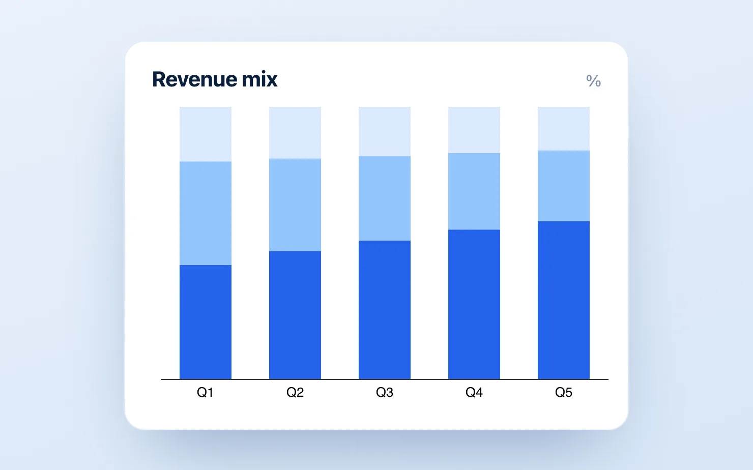
A 100% stacked bar chart answers one question: how does the mix change over time? Not how big the total got — that's a regular stacked bar — but how the share of each part moved. Revenue by segment, headcount by function, spend by category, votes by region. Every column reaches the top, and the story lives in how the bands inside grow and shrink.
Google Slides has no chart type called "100% stacked bar." But it's one setting away in Google Sheets, and about a minute away with an add-on. Here's each route, honestly.
When to use a 100% stacked bar (and when not to)
Use it when absolute totals don't matter to your point — you want to show composition. "Enterprise went from 20% to 32% of revenue" reads instantly on a 100% bar; on a normal stacked bar it's buried under the growth of the total.
Don't use it when the total is the story. If the audience needs to see that revenue tripled, a 100% bar actively hides that — every column looks the same height. Use a regular stacked bar there, or show the total on a second axis.
Also skip it with more than ~5 segments (the thin bands become unreadable) or when two adjacent years barely differ — the eye can't judge a 2-point shift in a stacked band. In those cases a small-multiples set of pies or a plain line of one segment's share often wins.
Option 1: Google Sheets chart editor (free, native, a bit of a loop)
Slides borrows all its charts from Sheets, so this is the supported path:
- In Google Sheets, lay your data out as rows = segments, columns = periods (or the transpose — the editor handles both).
- Select the range and choose Insert → Chart.
- In the Chart editor, set Chart type to Stacked bar chart (or stacked column for vertical bars).
- Open the Customize → Chart style section — near the stacking control, switch stacking from Standard to 100%. Every column now normalizes to full height.
- Add data labels (Customize → Series → Data labels) so each band shows its percentage.
- Back in Slides: Insert → Chart → From Sheets, pick the chart, and keep Link to spreadsheet checked so an Update button appears when the data changes.
This works and costs nothing. The catch is the round-trip: your data and your slide live in two files, restyling happens in the cramped Sheets editor, and every revision means switch to Sheets, edit, come back, click Update. Fine for one chart; tedious across a deck. (Full walkthrough of the linking step: insert a Google Sheets chart into Slides.)
Option 2: Build it elsewhere and paste an image (the screenshot trap)
Excel, think-cell, or a web charting tool, then screenshot into Slides. It looks fine and it's a maintenance dead end — the image doesn't update, so every data change repeats the whole loop. This is also the only way to get a think-cell chart into Slides at all, since think-cell runs only in PowerPoint. Avoid it for anything you'll revise.
Option 3: Build it natively in Slides with ChartKit (about a minute)
ChartKit is a Chrome extension that builds charts inside the deck, no Sheets file and no screenshot:
- Open ChartKit from the Slides sidebar, pick Stacked bar, and toggle the 100% (normalized) option.
- Paste your data straight into the grid.
- Turn on segment labels to show each share, and add a total or delta annotation if you want to call out a specific shift (e.g. a "+12 pts" pill on the segment that grew).
- Insert. It's a native, editable chart — restyle or re-data it in place, no round-trip.
Because the data lives with the chart, updating next quarter is a paste, not a five-step loop. The 100% stacked bar is one of the types ChartKit does out of the box, alongside waterfalls and standard stacked bars — the workhorse charts of a finance or strategy deck. For how it compares to the other native add-ons, see the think-cell alternatives roundup.
Make it readable: three quick rules
- Order segments largest-at-the-bottom, consistently across all columns — so the eye tracks each band left to right.
- Label the shares, not the raw values. A 100% bar's whole job is proportion; put "32%" in the band, not "€4.1M."
- Sort the categories to make the trend obvious — chronological for a time series, or ranked if you're comparing groups at one point in time.
Common questions
Does Google Slides have a 100% stacked bar chart type? Not directly. You build it in the Google Sheets chart editor (set stacking to 100%) and insert it into Slides, or use an add-on like ChartKit that builds it natively in the deck.
What's the difference between a stacked bar and a 100% stacked bar? A regular stacked bar shows absolute values, so column heights vary with the total. A 100% stacked bar normalizes every column to full height, so it shows share — the mix — and hides the total.
How do I show percentages instead of values on the bars? When stacking is set to 100% in the Sheets chart editor, data labels display each segment's percentage of the column automatically. In ChartKit, turn on segment labels.
Can I do 100% stacked columns (vertical) too? Yes — same setting, just choose the stacked column type instead of stacked bar. The 100% normalization is identical.
Building a composition slide today? Make a 100% stacked bar natively in Google Slides in about a minute.
Download and try ChartKit for free — 10 charts a month on the Free plan, no card required.