If you've ever rebuilt a waterfall in PowerPoint, screenshotted it, pasted it into Google Slides, and then done the whole thing again when the numbers changed — you already know that workflow doesn't survive contact with a real reporting cycle. think-cell, the gold standard for waterfall charts, runs only in PowerPoint; for anyone living in Google Slides, the chart that management decks depend on most has no native home.
This guide covers the three actual ways to build a waterfall chart in Google Slides, from free-and-painful to fast-and-paid — and is upfront about where each method genuinely wins.
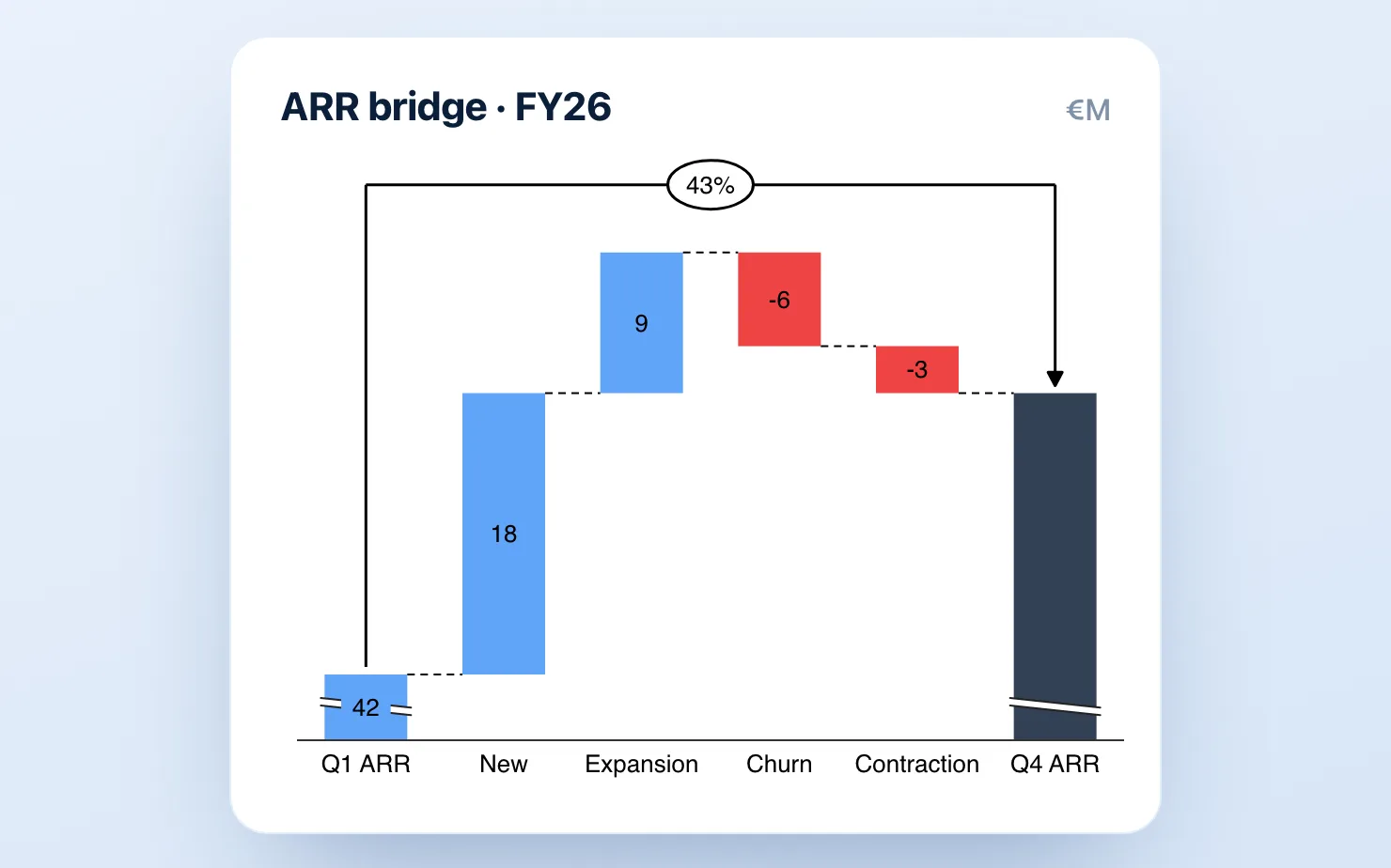
What makes a "real" waterfall chart
Before the methods, a quick definition check, because Google's built-in tools fail on exactly these points. A management-grade waterfall (also called a bridge or walk) needs:
- Floating bars that start where the previous bar ended
- Subtotal and total bars that drop to the baseline
- Connector lines between bars
- Color logic — one color for increases, one for decreases, a neutral color for totals
- Value labels that sit on or above each bar
If your chart is missing connectors or can't do subtotals, it's not a waterfall — it's a column chart wearing a costume.
Method 1: The Google Sheets waterfall (free, limited)
Google Sheets does have a waterfall chart type, which you can embed in Slides.
- In Google Sheets, lay out your data in two columns: category labels and values (negatives as negative numbers).
- Select the range, then Insert → Chart.
- In the Chart editor, set Chart type → Waterfall.
- In your Slides deck, Insert → Chart → From Sheets and select the chart. (If you need the basics of that step, see how to insert a Google Sheets chart into Google Slides.)
Where it breaks down: Sheets' waterfall doesn't handle subtotals properly, connector styling is minimal, label control is poor, and any edit means a round-trip back into Sheets. The chart also tends to fight you on colors — getting a clean blue/red/slate consulting palette takes longer than building the data did. For a one-off internal chart, it's fine. For a monthly board deck, it becomes the thing you dread.
Method 2: The stacked-bar hack (free, painful)
The classic workaround: build a stacked bar chart where the bottom segment of each bar is invisible, creating the "floating" effect.
- For each category, calculate a hidden "base" value (the cumulative total before that bar).
- Build a stacked bar chart with two series: the invisible base and the visible change.
- Set the base series fill to transparent.
- Draw connector lines manually with the line tool.
- Add every label as a separate text box.
This works, and consultants have been doing it in Excel since the 1990s. But in Google Slides it takes 15–30 minutes per chart, the manual connectors and text boxes shift every time the layout changes, and a single data update means redoing most of it. If you only ever build one waterfall, use this method. If you build one every month, the math stops working fast.
Method 3: A native add-on (fast, paid)
This is the category that exists because of Methods 1 and 2. Add-ons like ChartKit and ChartBuddy build real waterfalls directly inside Google Slides — floating bars, subtotals, connectors, labels — as native, editable objects rather than pasted images.
With ChartKit the workflow is:
- Open the ChartKit panel inside Google Slides.
- Choose Waterfall and paste or type your values.
- Mark which rows are subtotals or totals.
- Place the chart on the slide. Edit values any time — the chart updates in place.
That's roughly 90 seconds, which is not coincidentally the same time it takes in think-cell. Deltas, totals, annotations, and axis breaks are built in. ChartKit is €8/month after a 14-day trial; ChartBuddy is around €10/month and also does waterfalls well — the honest difference is covered in our full comparison.
What if it's a revenue bridge, or you're coming from PowerPoint?
A waterfall goes by other names depending on the room. Finance teams call it a bridge or a walk - a revenue bridge, a margin bridge, a variance bridge - but it's the same chart, and every method above builds it. If bridges are a recurring part of your board pack, the FP&A playbook for board-ready charts in Google Slides walks through the exact reporting cycle.
If you're moving off PowerPoint and want the side-by-side of how the waterfall works across Excel, PowerPoint, and Google Slides, we cover all three in how to make a waterfall chart in Excel, PowerPoint, and Google Slides.
Which method should you use?
| Sheets waterfall | Stacked-bar hack | Add-on (ChartKit / ChartBuddy) | |
|---|---|---|---|
| Cost | Free | Free | €8–10/mo |
| Time per chart | ~10 min | 15–30 min | ~2 min |
| Subtotals | ❌ | Manual | ✅ |
| Survives data updates | Partly | ❌ | ✅ |
| Consulting-grade output | ❌ | With effort | ✅ |
Rule of thumb: if you build waterfalls less than once a quarter, use Sheets and accept the limits. If they're part of a recurring deck — board pack, QBR, monthly operating review — the add-on pays for itself in the first chart.
Common questions
Can Google Slides make a waterfall chart natively? Not directly. You can embed a Google Sheets waterfall, but it lacks proper subtotal support and storytelling controls. There's no waterfall option in Slides' own insert menu.
How do I add a total bar to a Google Sheets waterfall? Sheets supports a subtotal-style column only awkwardly, via the "Add subtotal" option in the chart editor, and it doesn't handle intermediate subtotals the way think-cell does. This is the single most common reason people abandon the native method.
Is there a free think-cell-style waterfall for Google Slides? The Sheets method and the stacked-bar hack are free. Add-ons like ChartKit offer free trials (14 days, no card) so you can test against a real deck before paying.
If the waterfall is part of a recurring deck, skip Methods 1 and 2 entirely: get started for free — no credit card required — and build the next revenue bridge in 90 seconds, inside the deck.