Every month, the same ritual: close the books, update the model, and then spend half a day wrestling the numbers into charts for the board update. If your company runs on Google Workspace, that last step is disproportionately painful — because the chart the board most expects to see, the variance bridge, is genuinely not possible in native Google Slides.
This is a playbook for FP&A teams and finance leads building recurring board and investor decks in Google Slides: which charts the pack needs, the standards that make them board-grade, and how to make the monthly rebuild stop being a rebuild.
The five charts of the board pack
Most board and investor updates run on five chart patterns:
1. The ARR / revenue bridge. Opening ARR → new → expansion → contraction → churn → closing ARR. A waterfall with the start and end bars dropped to the baseline. This is the single most important chart in a SaaS board deck, and the one native Slides can't build (the Sheets waterfall doesn't handle the total bars or connectors properly).
2. The budget variance bridge. Budget → driver-level variances → actual. Same waterfall mechanics, color-coded: favorable in one color, unfavorable in another, totals neutral. This is the chart that answers "why did we miss?" before anyone asks.
3. The burn / cash walk. Opening cash → operating burn components → financing → closing cash. Boards read runway off this chart; precision in the subtotals matters.
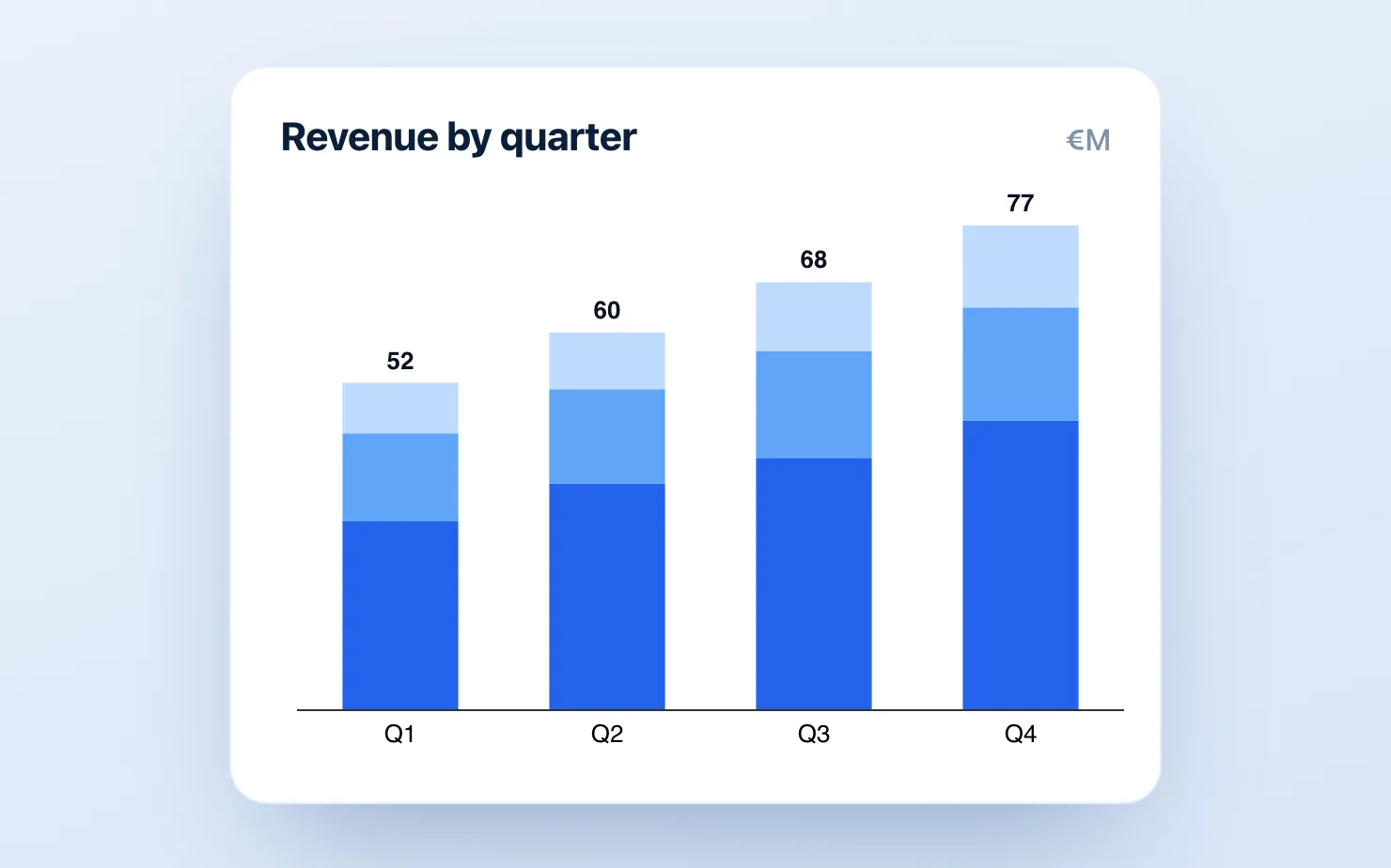
4. The cost-structure stacked bar. Opex by category over trailing months — a stacked bar, or a 100% bar when the story is mix shift rather than absolute growth.
5. The KPI trend lines. NRR, gross margin, magic number — line charts with the prior-year comparison and an annotation on the inflection that you'll be asked about anyway.
If your pack covers these five cleanly, you're ahead of most Series B reporting.
Board-grade standards (the part that's free)
Tools aside, these conventions are what separate board-ready from "finance made a chart":
- Every bridge labels every bar, and the start/end totals are visually distinct (neutral color, full-height) from the movements.
- Favorable/unfavorable coloring is consistent across the whole deck — if green is good on slide 4, red can't mean "Region EMEA" on slide 9.
- Axes start at zero, or the break is shown explicitly. Boards contain investors; investors notice truncated axes, and it costs credibility precisely when you need it.
- Annotate the anomaly before they ask. A one-line callout on the chart ("includes €240k one-off audit fee") prevents ten minutes of meeting time.
- Same chart, same position, every month. Boards build pattern recognition; moving the ARR bridge to a different slide each month resets it.
The workflow problem — and the fix
The standards above are achievable in any tool. The problem is doing them monthly. The native paths both fail at recurrence:
- Sheets-embedded charts can't do real bridges (no proper totals/subtotals, weak labels) and every styling fix means a round trip to Sheets.
- Hand-built bridges (the transparent stacked-bar hack plus manual connectors and text boxes) take 20–30 minutes each, and a late change to the close means redoing them at 11pm before the board meeting. Five bridges × twelve months is a week of skilled-finance-person time per year spent moving rectangles.
- The PowerPoint detour — building in Excel or think-cell and pasting images into the deck — produces dead images in a living deck: every late change to the close means a round trip back through the other application.
The fix is a native charting add-on, so the chart is an editable object inside the deck. With ChartKit (€8/mo, 14-day trial), the monthly cycle becomes: duplicate last month's deck, click into each chart, update the values, done — the bridge re-renders with totals, connectors, deltas and labels intact. Waterfall, stacked bar, 100% bar and line cover all five chart patterns above, and axis breaks are built in for the chart where the interesting movement is 4% of the bar height. (ChartBuddy, ~€10/mo, is the alternative with a broader chart library — honest comparison here.)
The deeper win isn't the 25 minutes per chart; it's that late changes stop being scary. When the close moves a number at 6pm, you edit a value instead of rebuilding a slide.
Setting up the repeatable pack
One-time setup, roughly an afternoon:
- Build the master deck — the five charts, styled to your standards, on locked layouts.
- Standardize the data handoff — one tab in your reporting Sheet formatted exactly as the charts consume it, fed by the model.
- Write the two-line runbook — which cells feed which chart — so the deck survives your vacation.
- Duplicate monthly. The board deck becomes a 30-minute update, not a half-day build.
Common questions
Can Google Sheets make a proper variance bridge? Not really. The Sheets waterfall type exists but mishandles intermediate subtotals and offers minimal connector and label control — the exact features a variance bridge needs. Details in our waterfall guide.
What does the board actually look at? Ask them — but the consistent pattern: the ARR bridge, the runway off the cash walk, and any chart where the actual diverges from plan. Optimize those three first.
We report in both Slides and a PDF — does this still work? Yes. Native charts export cleanly in Slides' own PDF export, unlike screenshots, which tend to ship at whatever resolution the paste happened to be.
The next close is coming either way. Get started for free — no credit card required — and build the ARR bridge once, as an editable chart, before the next board cycle.