
How to make McKinsey-style charts in Google Slides
5 min read
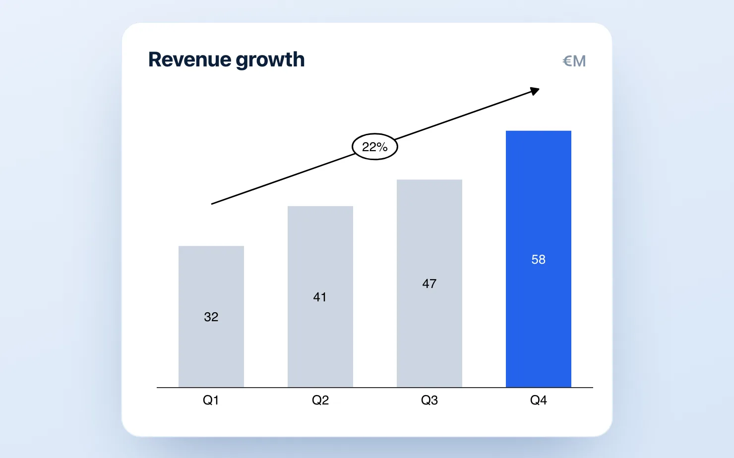
Everyone recognizes a McKinsey chart on sight. Gray bars, one blue accent, a CAGR arrow, a title that states a conclusion instead of a topic. What most people miss is that none of this is a template — it's a small set of design rules, applied without exception. The rules are learnable in an afternoon.
The problem is where you're applying them. Google Slides' native charts fail on most of the rules by default, and a few of them can't be applied natively at all. This guide covers both halves — the rules, and how to actually execute them in Slides.
The seven rules that make a chart "McKinsey-style"
1. The title is the takeaway. Not "Revenue by quarter" but "Revenue grew 34% on subscription strength." The chart's only job is to prove that sentence. This rule is free and applies in any tool — if you adopt nothing else, adopt this. (It's the core of the action-title discipline ex-consultants carry into Slides.)
2. One message per chart. If the chart shows two things, it's two charts. Everything not serving the message moves to the appendix.
3. Direct labels, no legend. Series names sit on or next to the data. A legend forces the reader's eye to ping-pong across the slide; consulting decks almost never use one.
4. Gray plus one accent. Every bar is neutral except the one the title is about. Color is an argument, not decoration — the accent tells the reader where to look before they've read a number.
5. Label the totals, annotate the change. Stack totals get a bold number on top. Growth gets a CAGR arrow or a delta bracket — the annotation is the analysis. A bar chart without a labeled delta makes the reader do subtraction; a McKinsey chart never does. (Basics in how to add data labels in Google Slides.)
6. No chartjunk. No 3D, no gradients, no background fills, no gridline forest. Axis lines thin and gray, or gone entirely once every bar is labeled.
7. The right chart type for the message. Change over steps → waterfall. Market structure → Mekko. Qualitative comparison → Harvey balls. Consulting decks lean on exactly the types Google Slides doesn't have.
Why Google Slides fights you on this
A Slides chart is really an embedded Google Sheets chart, and Sheets was built for spreadsheet users, not deck builders. Against the seven rules:
- Defaults are the opposite of rule 4 and 6 — a multi-color palette, gridlines everywhere, a legend on by default. You can fix these, but you're fixing every chart, every time, through the Sheets chart editor.
- Rules 5 and 7 aren't fixable. There's no CAGR arrow, no delta bracket, no waterfall with real subtotals, no Mekko, no Harvey balls. These aren't settings you haven't found — the features don't exist.
- Every edit is a round-trip into Sheets, which is where recurring decks go to die.
That leaves two real options.
Option 1: Draw it manually (free, slow)
Shapes, lines, and text boxes on the slide. Consultants did this in the pre-think-cell era, and it works — the stacked-bar waterfall hack is the classic example. Budget 20–30 minutes per chart, and accept that every data update means nudging text boxes and re-drawing arrows. Fine for a one-off. Fatal for a monthly deck.
Option 2: A native add-on (fast, free to start)
This is what the style's home tool — think-cell — does in PowerPoint, and think-cell doesn't exist for Google Slides. Add-ons fill the gap by building the consulting chart types directly in Slides as editable objects.
With ChartKit, the seven rules map to built-in features:
- Open ChartKit inside Google Slides and pick the type — waterfall, stacked bar, Mekko, Harvey balls, and the rest of the consulting set.
- Paste your data. Defaults are already rule-compliant — clean axes, no gridline forest, direct labeling.
- Set the accent — one click to focus a single bar or segment, neutrals for everything else.
- Add the annotation — CAGR arrow, delta bracket, totals, reference lines, axis breaks.
- Place it on the slide. When the numbers change, edit the chart in place — no round-trip, no re-drawing.
That's the 90-second workflow the style was designed around. ChartKit is free to install — 10 charts a month on the Free plan, every chart type included — with unlimited at €10/month. ChartBuddy (~€10/month) covers similar ground — the honest side-by-side is in the comparison.
The checklist
Before a chart ships, five seconds against the rules:
- Title states the takeaway, not the topic
- One message; everything else cut or appendixed
- No legend — labels on the data
- Gray everywhere except the one thing that matters
- Totals labeled, the change annotated
- Nothing decorative survives
- The chart type matches the message
Run every slide in the deck through it. The difference between a deck that looks "fine" and one that reads like a consulting deck is rarely talent — it's whether the rules were applied on slide 14 too.
Common questions
What makes a chart McKinsey-style? A message-first design system, not a template. Action title, direct labels, gray plus one accent, labeled totals, annotated change, zero decoration. The chart exists to prove one sentence.
Can Google Slides do this natively? Only partly. The color and gridline defaults can be fixed by hand in the Sheets editor; the waterfalls, Mekkos, CAGR arrows, and label control cannot — those need shapes drawn manually or an add-on.
What do McKinsey consultants actually use? think-cell, in PowerPoint. It has no Google Slides version, which is why the add-on category exists.
The rules are free — start with action titles today. For the chart types the rules demand, build the next one inside the deck.
Download and try ChartKit for free — 10 charts a month on the Free plan, no card required.