
A chart without an annotation shows the audience data and leaves them to find the point. The annotation is the point. A CAGR arrow says the business grew at a steady rate, a delta says one step mattered, a target line says whether the number is good enough. Consulting charts carry these almost by default, and Google Slides can't draw any of them.
This guide covers each annotation ChartKit supports, when to use it, an example of the message it carries, and how Slides handles the same job natively. It ends with a decision table and with what the ChartKit Chat docked in Slides can do for you here, including the rewriting tools for action titles.
Why native Slides charts can't do this
A native chart in Google Slides is a chart piped in from Google Sheets, or a picture. The chart editor controls series, colors, axes and data labels. It has no arrow that measures between two bars, no growth-rate callout, no reference line you can label, and no way to collapse part of the axis.
So people improvise. They draw an arrow shape over the chart, type a percentage into a text box and nudge both into place. This works for a slide that never changes. It breaks the first time a number moves, because the shapes are not connected to the data. The arrow still points at where the bar used to end and the text box still says the old rate. Every update becomes a hunt for every number you typed by hand.
An annotation that belongs to the chart avoids that. It is anchored to bars or to a value, it reads its numbers from the chart data, and it moves with the chart when you resize it. That is the standard we use below. In ChartKit the arrows, lines and breaks work on the bar, line, scatter and waterfall families. Mekko, donut, bubble, Harvey ball and Gantt charts don't take them.
Delta arrows: how much one bar moved against another
Use it when the message is a difference between two specific points. Year on year, plan against actual, this segment against that one.
A delta arrow connects two bars and prints the change in a bubble on the line. You pick absolute (+13) or percentage (+21%). Percentage fits a change over time. Absolute fits two values in the same unit that the audience will subtract in their head anyway, and it is the safer choice when either value is zero or negative.
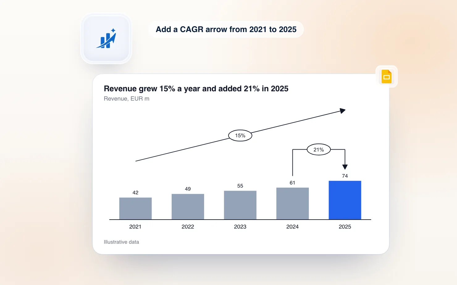
Example. Revenue goes from 61 to 74 in the last year. The delta reads +21%, and the slide title says "Revenue grew 21% in 2025, the fastest year in the series". The title makes the claim and the arrow shows where it comes from.
In ChartKit, press D or pick the delta tool in the chart toolbar, then click the two bars. You can drag the arrow up to clear other labels and drag the bubble along the line.
ChartBuddy has the same annotation. Its help docs say right-click the chart background, click Add difference arrow, and the arrow is drawn between the first two columns. You then drag the end handle to the bar you want and drag a second handle to lift the arrow clear of the labels. Both tools get you to the same result. The difference is that ChartKit starts from the two bars you click rather than from the first two columns.
CAGR arrows: how fast it grew per year
Use it when the message is growth across several years and the individual steps would only add noise. A CAGR (compound annual growth rate, i.e. the steady yearly rate that gets you from the first value to the last) turns five bars into one sentence.
Example. Revenue goes from 42 in 2021 to 74 in 2025. The CAGR arrow runs from the first bar to the last and reads 15%. The slide says "Revenue compounded at 15% a year since 2021".
Two rules keep it honest. Use it across yearly categories only, because a compound annual rate means little across months or quarters. For those, use a delta. And pick the start and end years deliberately, since a CAGR hides what happened in between. If the middle years matter, say so in the title or add a delta on the odd one out.
ChartKit calculates the rate from the values in the chart. Edit a number in the data and the label recomputes, which is the part a hand-typed text box can't do. Press C and click the first and last bar.
ChartBuddy's help page for this describes the same flow. You right-click the background, click Add CAGR and the arrow is drawn over the first span. You then drag the end handle to the top of the last bar so it covers the full period. The page doesn't list supported chart types, so check your chart type there before you rely on it.
The two annotations often sit on the same chart, which is how the image at the top of this article is built. A CAGR across the whole run sits above, and a delta on the last step sits below it.
Level and reference lines: where the number sits against a target
Use it when the message is a comparison against a fixed value. A budget, a target, a covenant limit, an industry average.
There are two annotations here and they answer different questions.
A reference line is a horizontal line at a value you choose, with its own label. It spans the full plot, so every bar is compared against it at once. Use it for "which quarters beat the target".
A level is an arrow with a label that measures between two levels, with dashed guides running to each bar. Use it when the gap itself is the message, for example the distance between a forecast bar and an actual bar. It is a measured bracket, where a reference line is a fixed mark.
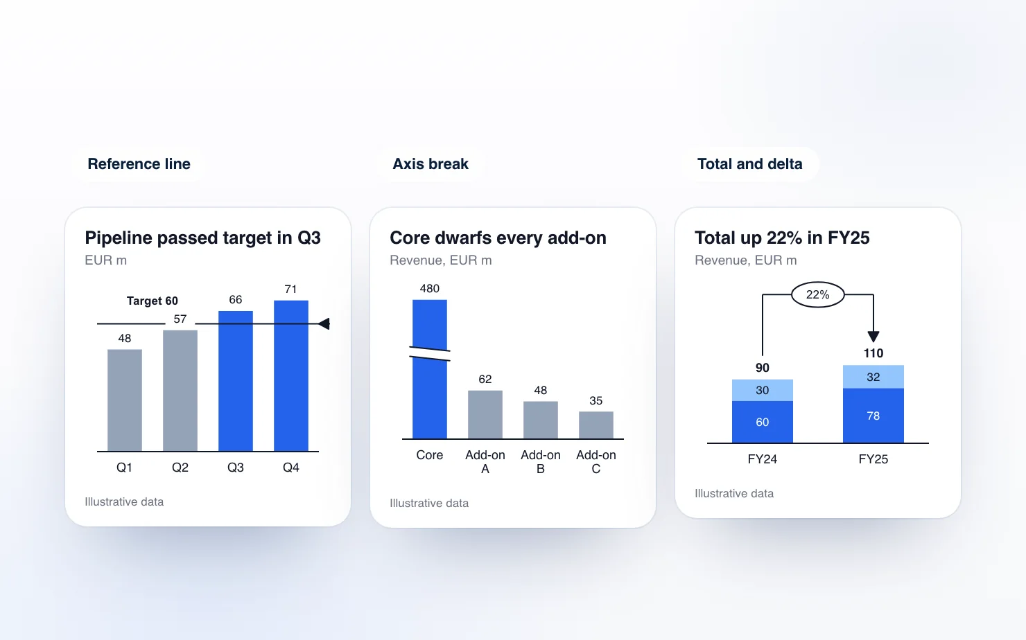
Example. Quarterly pipeline reads 48, 57, 66 and 71 against a target of 60. A reference line at 60 labelled Target 60 shows Q3 and Q4 clearing it, and the title says "Pipeline passed target in Q3 and stayed above it".
The reference line sits at a value on the scale. It is not read from the data, so if the target moves you change the line. It does stay at that value when you resize the chart or change the data, which a line shape on the slide does not.
In ChartKit, press R and click the height you want for a reference line, or press E and click two elements for a level. ChartBuddy's level line works from a right-click menu. Its help page says a line appears at a starting value and you drag it to your value, with color, width, style and value controls in the line toolbar.
Axis breaks: when one bar flattens the rest
Use it when one category is several times larger than the others and the small bars have become unreadable. Typical cases are a core product next to three add-ons, or an opening balance next to the changes in a bridge.
An axis break collapses a range of the value scale into a short band. The scale stays linear above and below the band, and the bars that cross it are drawn with a visible break so nobody mistakes the cut bar for its true height.
Example. Core revenue is 480 and the add-ons are 62, 48 and 35. Without a break, the add-ons are three slivers. With the break, they get most of the plot height and their labels stay readable. The caveat is that bar heights can't be compared across the break, so keep the numbers printed on the bars.
This is the annotation that matters most in a waterfall, where the opening and closing totals dwarf the steps between them. The waterfall chart guide shows it in context.
In ChartKit, press B and click the chart. The break lands in a gap between plotted values and you can drag its edges to hide more or less. ChartBuddy's help page describes the same idea. You click Add break and drag the handle into the top segment of the tall column until the smaller categories are readable.
Connectors: linking the steps
A connector is a plain line between two points on the chart, with optional label. It carries a lot of weight in waterfalls, where the dashed line from the top of one bar to the start of the next is what makes the chart read as a running total.
In a waterfall, ChartKit has an Auto connector toggle that links every step in one click. Elsewhere, add one with the connector tool and click its two end points. Use them sparingly outside waterfalls. A connector that isn't carrying a sequence is usually clutter.
Total labels: the sum above a stack
Use it when a stacked bar needs its total visible next to its parts. Without totals, the audience adds the segments up themselves, or guesses.
A total label is one bold number above each stack. It is a data label rather than an arrow, but it belongs in the same toolkit because it pairs with a delta. In the figure above, the total reads 90 for FY24 and 110 for FY25, and the delta between those two totals reads 22%. The arrow anchors to the stack total.
Totals only make sense for stacking chart types, so ChartKit offers them on stacked bars, 100% stacked bars, waterfalls and Mekkos, and not on clustered bars. Toggle them with T or the Totals button. For the rest of the labeling toolkit (segment values, share labels, formats), see the data labels guide.
ChartBuddy's help page for this describes a right-click menu item, Show all total labels, with the totals then appearing above each column.
Which annotation for which message
| The message is | Use | Example title |
|---|---|---|
| One step changed a lot | Delta | Revenue grew 21% in 2025 |
| Growth compounded over years | CAGR | Revenue compounded at 15% a year since 2021 |
| We are above or below a target | Reference line | Pipeline passed target in Q3 |
| The gap between two values is the story | Level | Actual landed 8 below forecast |
| One bar hides the rest | Axis break | Add-ons are small next to core, so the break gives them room |
| The sequence adds up to a total | Connector | ARR bridge from FY24 to FY25 |
| The whole stack matters, not only the parts | Total label | Total revenue reached 110 |
If you are tempted to add three annotations to one chart, ask which message is the title. Pick that annotation and let the others go. Stack a CAGR, two deltas, a target line and a break on one chart and the audience has to decide what to read first. These choices are part of the house style that McKinsey-style charts share, where one chart carries one claim.
ChartKit Chat: ask for the annotation
You can place every annotation above with a click. You can also ask for it.
ChartKit Chat is a chat panel docked inside Google Slides. It runs on Claude through your own subscription, using a local connection that ChartKit Desktop provides, or on an endpoint your team admin sets up. ChartKit doesn't resell model usage. It is a Pro feature, with a free Pro trial.
The chat works on the deck in front of you. Its tools cover reading the current slide and selection, writing text, building and replacing slides, inserting charts, and placing saved components and layouts. For charts it does two things that matter here.
It inserts charts with annotations already on them. Ask for "a line chart of revenue by region with a CAGR arrow from 2021 to 2025" and the chat inserts an editable ChartKit chart with that annotation. Its chart input accepts the same annotations as the toolbar. Those are delta, CAGR, reference line, a value band, level and axis break. If you ask for a chart that is already on the slide to change, it replaces the old one in the same frame.
It edits annotations on a chart you have open. With a chart open in ChartKit's editor, the chat can read the chart as JSON and change it, including adding an annotation. "Add a CAGR arrow from 2021 to 2025" or "add a reference line at 60 labelled Target" are ordinary requests. The edit is checked before it is applied, so an invalid change returns an error and leaves the chart untouched. Open the chart first. If no chart editor is open, the chat tells you so.
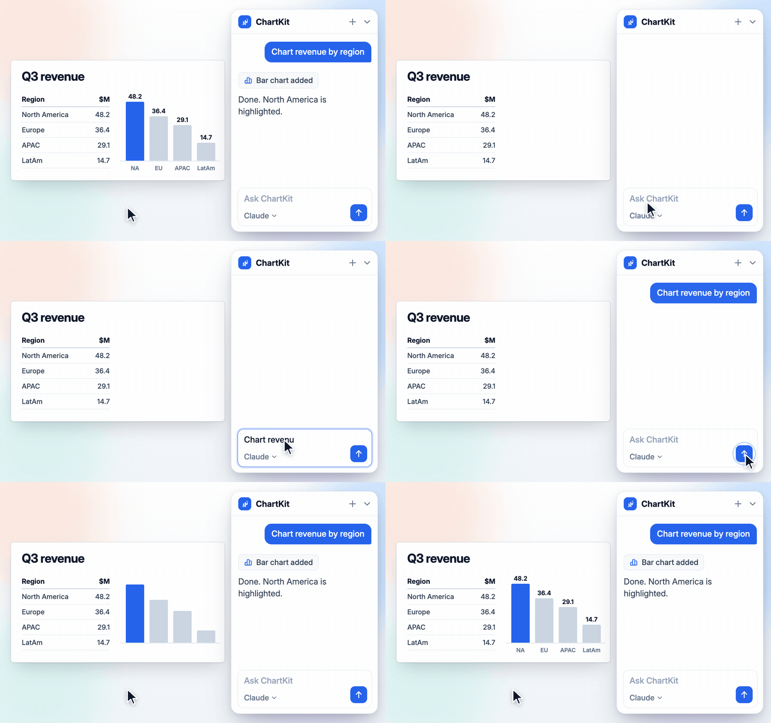
The chat inserting an editable chart from a one-line request. Annotations are one more line in the same request.
The chat has limits worth knowing. It needs ChartKit Desktop running, or a team endpoint, so it is not a zero-setup feature. The first time it edits a deck it asks for permission to do so. And it only edits annotations on a chart that is open in the editor. For charts you have not opened, insert a replacement or open the chart and ask again.
If you work in claude.ai rather than in Slides, the ChartKit connector does the same first step. Ask Claude for a chart, then insert it into Slides as an editable chart. When you send no annotations, the connector adds the obvious one itself, a CAGR across years or the first-to-last change across other ordered categories. There is more on this route in the AI chart generator guide.
Rewrite the title so it carries the claim
An annotation and a title do one job together. The annotation shows where the claim comes from. The title states it. A chart with a CAGR arrow and the title "Revenue by year" wastes the arrow.
ChartKit's writing pill handles the title. Click a text box on the slide and the pill opens a command bar with four actions, Improve, Shorten, Action title and Write (Write only when there is no text yet). It runs on the same Claude subscription as the chat.
Action title rewrites the selected text into a consulting-style title. The instruction the pill sends asks for one sentence that states the takeaway with a verb, at most 14 words, with no trailing period. Give it "Revenue by year" over a chart that shows a 15% CAGR and you should get something close to "Revenue compounded at 15% a year from 2021 to 2025". Check the number against your chart. The pill rewrites wording, so it can only be as accurate as the text you give it.
After a result appears, Shorter, Longer, Formal and Casual re-run the rewrite on that result. A Changes toggle shows a word-level diff against your original, and you can replace the text, insert the result below it or discard it. The same chat can also write text for you. "Rewrite this title so it states the takeaway" is a normal request there, and it can do the whole slide at once.
A practical order of work, once the chart exists. Add the one annotation that carries the message, run Action title on the heading, then read the two together. If the title claims 15% and the arrow reads 14%, one of them is wrong, and it is faster to find out on the slide than in the review.
What this changes in your workflow
Annotations stop being the last ten minutes of a slide. Because they belong to the chart, you add them once and then change the data. The label and the arrows follow. If the chart is connected to a Google Sheet, refreshing the data refreshes the CAGR and delta values with it, with no hand-edited text left to go stale.
If you currently draw arrows and text boxes over native charts, the first slide you rebuild is the one you will notice. If you are coming from think-cell, these are the annotations you already know. The think-cell alternative comparison covers where ChartKit and ChartBuddy each fit. ChartKit has a free plan with 10 charts a month, and Pro is €10 a month. Install ChartKit, build one chart from your latest deck, and add the annotation your title is already claiming.