
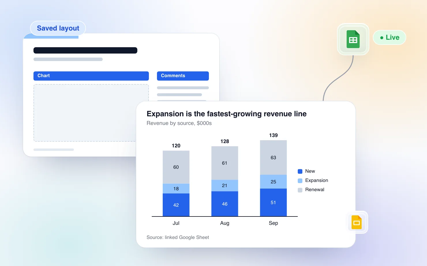
If a data team owns the report and it ships in dozens of versions, buy a reporting platform. If one analyst owns the monthly pack and the numbers already sit in a Google Sheet, you can stop rebuilding it without buying anything that connects to a warehouse. Keep the deck in Google Slides, link the charts to the sheet, and save your slide structure as layouts so next month starts from a finished slide.
This guide covers both routes, says where the platforms are the better choice, and ends with a setup checklist you can run once.
Two ways to stop rebuilding the pack
Every monthly pack burns time in the same places. Someone exports the numbers, pastes them into charts, fixes the formatting, rewrites last month's titles and checks that the footer still says the right month. None of those slides is hard to build. The time goes because nothing in them carries over to the next month.
You can fix that at two levels.
- A reporting platform. Rollstack, Slideform and UpSlide connect data sources to a template and produce the deck for you. The work moves into setup, mapping and procurement, and the payoff is volume.
- Reusable pieces inside Slides. Charts stay linked to a Google Sheet and refresh in place. Slides you have already got right are saved as layouts and placed into the next deck. Commentary is the only part you still write.
The second route is cheaper and quicker to start. It also does less, and we say where below.
When a reporting platform is the right call
Platforms earn their price when reporting is a production line. Here is what each vendor says about itself, with the figures attributed.
Rollstack describes itself as "the AI presentation platform for data-driven reporting." Its homepage lists connections to Snowflake, Tableau, Power BI, Looker, Metabase, Excel and Google Sheets, and says decks are drafted in your own PowerPoint or Google Slides template, with a separate version per client, region or brand on a schedule. It lists SOC 2 Type II, HIPAA and GDPR, role-based permissions and audit logs, and says nothing reaches a stakeholder until your data team signs off. Its pricing page lists a Standard plan from $833 per month, billed yearly, with 5,000 syncs included.
Slideform says it turns connected data into presentations, documents, spreadsheets and emails, and maps data into approved templates with an AI assistant it calls the Analyst. Its homepage lists HubSpot, Looker, Google Sheets and Power BI among its core sources, outputs to Google Slides, PowerPoint, Docs, Word, PDF and email, and scheduled exports. It targets agencies, customer success and RevOps teams. We could not load its pricing page. ChartBuddy's comparison of these tools lists it from $200 per month for 200 slide updates, which we have not checked against Slideform itself.
UpSlide calls itself "the document production layer for finance." It is a Microsoft 365 add-in that keeps Excel tables and charts linked to PowerPoint and Word, with a content library and template management. Its homepage does not mention Google Slides. ChartBuddy's comparison describes it as quote-based with a five-license minimum and a setup of four to six weeks. Again, we have not confirmed those figures with UpSlide.
Pick one of these when any of the following is true.
- The numbers live in a warehouse or BI tool and nobody wants to copy them into a sheet first.
- One report turns into dozens, one per client, region or brand.
- You need scheduled delivery without a person pressing a button.
- A data team has to approve figures before they reach a stakeholder.
- Your finance team lives in Excel and PowerPoint on Windows, which is the UpSlide case.
ChartKit does none of that. It has no BI or warehouse connector and no scheduler. A person still opens the deck and clicks. For a report with that shape, a platform is the right tool and the setup cost is the price of the volume.
Keep the deck in Slides and make each piece reusable
Most monthly packs are not production lines. A finance lead, a chief of staff or a consultant owns one board pack and a few variants. For them a platform's setup cost buys little. What hurts is rebuilding the same slides every month, and three pieces remove most of that.
Live charts that refresh in place
Connect a ChartKit chart to a range in a Google Sheet once. ChartKit opens your spreadsheet in its own tab, you select the range there, and the chart is bound to it. In the editor the chart shows a "Linked to Sheets" badge, and on the slide a hover pill reads "Connected to Sheets" with an Update button.
Clicking Update pulls the range again and swaps the image on the existing slide element. Position and size stay where they were, and the labels, totals, deltas and colors you set stay too, because only the numbers change. Opening a linked chart for editing also pulls fresh data. We wrote the longer version in Live sync with Google Sheets and the tool-agnostic guide in How to make Google Slides charts update automatically from Google Sheets.
Two limits matter for a monthly pack. Refresh is a click per chart, not a schedule, so someone updates before the pack goes out. And the range is fixed, so the new month has to land inside the range the chart points at. The easy fix is a reporting tab in the sheet that always holds the current window, say the last six months, with every chart pointed at that tab. Roll the window forward and every chart picks it up.
Layouts keep the structure
A layout is a whole slide saved to your library. Select the slide you already got right, click "Save this slide" (it sits on the Arrange toolbar and at the foot of the Layouts tab in the Templates menu), name it, and choose Only me or Team. Next month, open the Layouts tab and click it. ChartKit adds a new slide after the current one, built the way you built the first one.
A layout holds the following.
- The whole page. Shapes, lines, groups, text, icons and charts, each at its exact position on the page, plus a solid background color.
- Charts as charts. A chart in a layout is not frozen into a picture. When you place the layout, ChartKit renders the saved chart model into a fresh image on the new slide, and the copy gets its own pointer, independent of the original. It is still an editable ChartKit chart. Because the copy is built from the saved model, it keeps its data source, so a chart you saved linked to a Sheets range is linked again after you place it. It arrives with the numbers it was saved with, so you click Update to pull the current ones.
- Page size. If the target deck has a different page size, everything scales by one uniform ratio and is centered. Nothing is stretched.
It does not hold the following, so nothing surprises you on the day.
- Tables, images and speaker notes. Tables and pictures are skipped when you save, and ChartKit names what it skipped. Speaker notes are not carried over.
- Placeholder reflow. A layout is not a Slides master layout. It adds a new slide, and you cannot apply it onto an existing slide.
- A live link back to the layout. Placing a layout makes a copy. If you save an improved version later, it is a new entry, and slides built from the old one stay as they were. That is the right behavior for a pack that went to a board last quarter, and a limit if you expect a master slide that updates everything.
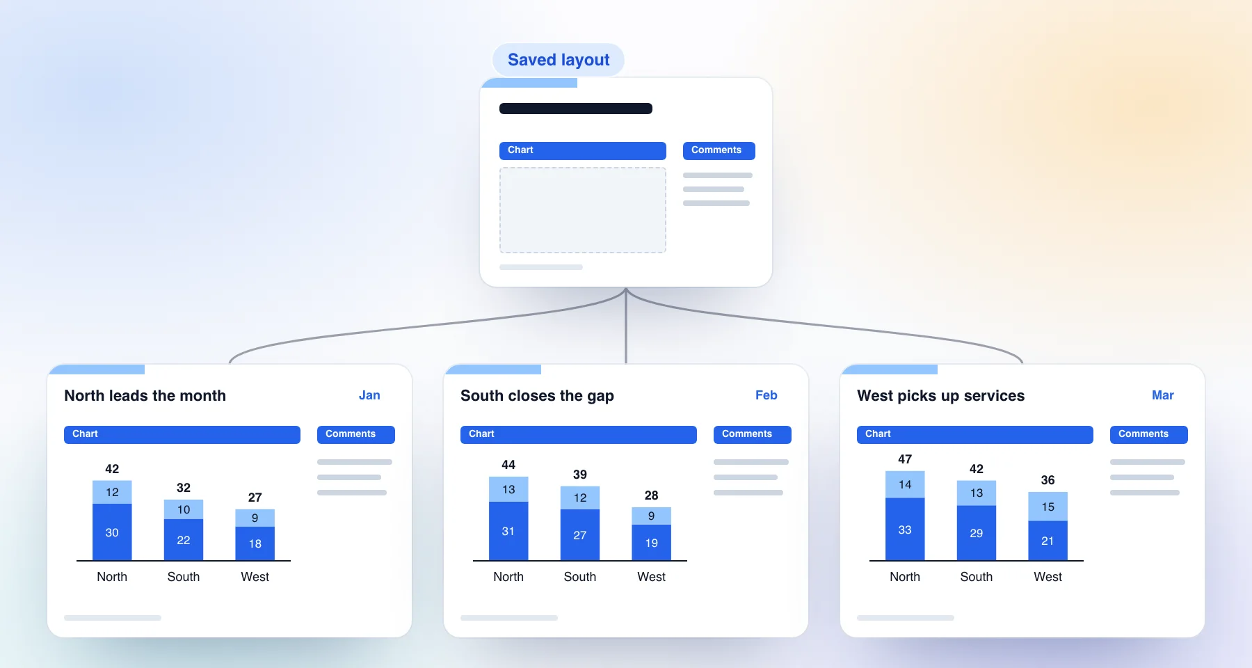
The figure shows the idea with illustrative data. One layout produces the same slide three months running. The title block, the chart frame and the comments column sit in the same place every time, and only the chart numbers and the sentence in the title change.
Layouts live in your ChartKit library, not in one deck, so they show up in any deck you connect. A layout saved as Team is visible to your team, which is how a pack stays consistent across people. When a second analyst builds the March slide, they place the same layout the first analyst saved in January, and the margins, the header block and the chart frame match without anyone checking. ChartKit also ships starter layouts in a Global tab, among them Two-thirds + one-third, Half and half, Full width, Agenda and Title slide. They are read-only, and most of their colors follow the deck's theme.
Layouts are Pro, and the switch button carries a Beta pill. ChartKit needs access to the deck before it can add a slide and asks through the Google Picker when it does not have it yet.
Components for the pieces inside a slide
A layout is a whole page. A component is a smaller piece, such as a row of KPI cards, a section tracker or a callout, saved from a selection and placed as native shapes. They share one Templates menu with the Charts and Layouts tabs.
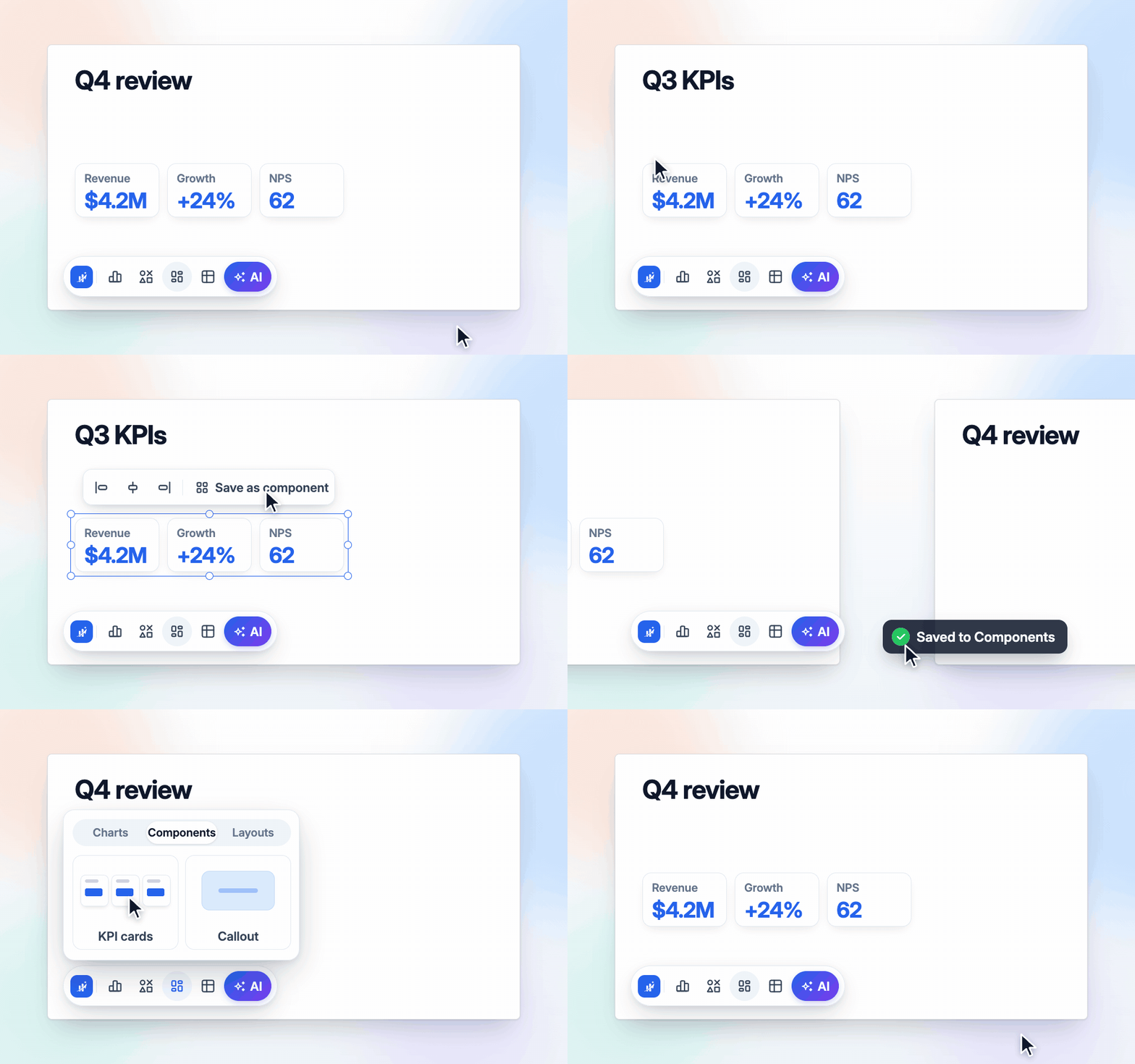
The clip shows components, not layouts. The cards are saved from a Q3 KPI slide and placed on a Q4 slide. The mechanics are covered in saving and reusing shapes in Google Slides. In a monthly pack, a layout gives you the slide and a component gives you the repeating block inside it.
Chat for assembly and commentary
ChartKit Chat is a chat docked inside Google Slides. It runs on your own Claude Code or Codex subscription through a local relay in ChartKit Desktop, or on a team's admin-set endpoint, so ChartKit does not resell model usage. It is a Pro feature with a free Pro trial.
On a monthly deck it does three useful things.
- Place a saved layout or component. The chat can list your saved components and layouts and add one by name, so "add the revenue bridge layout after this slide" works the same as clicking the card.
- Insert a chart. It builds an editable ChartKit chart from the data you give it and inserts it on the current slide, or replaces one already there.
- Rewrite commentary. It can write text into a text box or shape on the current slide. Separately, the writing pill on selected text offers Improve, Shorten and Action title, which suits turning "Revenue was up" into a headline that states the finding.
Chat does not connect to a warehouse on its own. It uses whatever tools your own agent has. It speeds up the clicking, and it does not schedule anything.
Platform or Slides-native reuse
| Reporting platform | Slides with ChartKit | |
|---|---|---|
| Data source | Warehouse, BI tools, CRM and sheets, depending on the vendor | A Google Sheet range per chart |
| Refresh | Scheduled or on demand, per each vendor | One click per chart, no schedule |
| Starting point for next month | A mapped template | A saved layout placed into a new deck |
| Output | Many versions per client, region or brand | One pack and a few variants |
| Approval and governance | Sign-off, lineage and audit logs on some platforms | Whatever your team already does in Slides |
| Setup | Connection, mapping and procurement, with demos on some | An afternoon building the first pack |
| Cost | Rollstack from $833 a month billed yearly, per its pricing page | Free 10 charts a month, then Pro at 10 euros a month or 80 euros a year |
| Best fit | Data teams running reports at volume | Analysts, consultants and founders who own the pack |
If you are unsure, count versions. One pack with a few variants favors Slides-native reuse. Thirty client versions of the same pack favor a platform. Teams that report in Google Sheets and Slides already can read how a finance team runs this in FP&A board charts in Google Slides, and agencies can see the client-by-client version in client reporting charts for agencies.
A monthly pack setup you run once
Do this for the first pack. Afterwards, the monthly job shrinks to steps 7 to 9.
- List the repeating slides. Open last quarter's deck and mark every slide that comes back each month. Ignore the one-offs.
- Build a reporting tab in the sheet. One tab holds exactly what the pack charts, with the current window in a fixed range. Formulas pull from your model, so the model stays the source of truth.
- Insert each chart from that tab. Select the range in Sheets and create the chart, or connect an existing one. See inserting a Google Sheets chart into Google Slides for the two paths.
- Finish one slide properly. Title block, chart frame, comments column, source line and footer, all in their final positions.
- Save each finished slide as a layout. Use "Save this slide", give it a name that says what it is, and choose Team if anyone else builds the pack.
- Save the repeating blocks as components. KPI rows, trackers and callouts you reuse inside slides.
- Update the sheet, then start the new deck. Place the layouts in order. Each chart arrives linked.
- Click Update on each chart. Pull the current numbers from the reporting tab.
- Write the titles and commentary. Use the writing pill or Chat for the first pass and check every number yourself.
Nothing here replaces judgment about what the month's story is. It removes the formatting and re-pasting around it.
Limits to plan for
- ChartKit does not connect to a warehouse, BI tool or CRM. Data goes through a Google Sheet first.
- There is no scheduled refresh and no scheduled delivery. A person updates and shares the deck.
- Layouts add a new slide. They do not restyle an existing one, and they do not carry tables, images or speaker notes.
- Chat and layouts need Pro and an access grant on the deck.
Common questions
How do I automate a monthly report in Google Slides? There are two routes. A reporting platform such as Rollstack or Slideform connects data sources to a template and fills it on a schedule. The other route keeps the deck in Slides, links each chart to a Google Sheets range so it refreshes in place, and saves your slide structure as layouts. The platform fits high-volume, BI-connected reporting. The Slides route fits a pack one team owns.
What is a Rollstack alternative for Google Slides? It depends on the job. Slideform is the closest template-automation alternative for many similar reports. For one recurring pack built by an analyst or founder, ChartKit with Sheets-linked charts and saved layouts keeps everything inside Google Slides, without data-source connectors or a sales call. For governed BI connections and scheduled per-client delivery, Rollstack is built for that and ChartKit is not.
Can Google Slides charts update automatically? Charts inserted from Google Sheets get an Update button, limited to the chart types Sheets can draw. A ChartKit chart connected to a Sheets range updates in place when you click Update on its pill, and it keeps its labels, totals and annotations. It does not refresh on a schedule.
What are ChartKit Layouts? A layout is a whole slide saved to your library and placed as a new slide in any deck you connect. It can be private or shared with your team. It is a copy, so slides already made from it do not change when you save a newer version.
Do Layouts and ChartKit Chat need a paid plan? Both are Pro features and the Pro trial includes them. The Free plan gives you 10 charts a month. Chat runs on your own Claude Code or Codex subscription through ChartKit Desktop, or on a team's admin-set endpoint.
When should I choose a reporting platform instead? When the data lives in a warehouse or BI tool, when one report becomes dozens of versions, when you need scheduled delivery, or when a data team signs off before numbers reach stakeholders.
If you rebuild the same monthly pack from a half-empty deck every cycle, try ChartKit for free. The Free plan covers Sheets-linked charts, and Layouts and Chat come with the Pro trial.
Running a pack across a team? Talk to us about team access so everyone places the same saved layouts.