
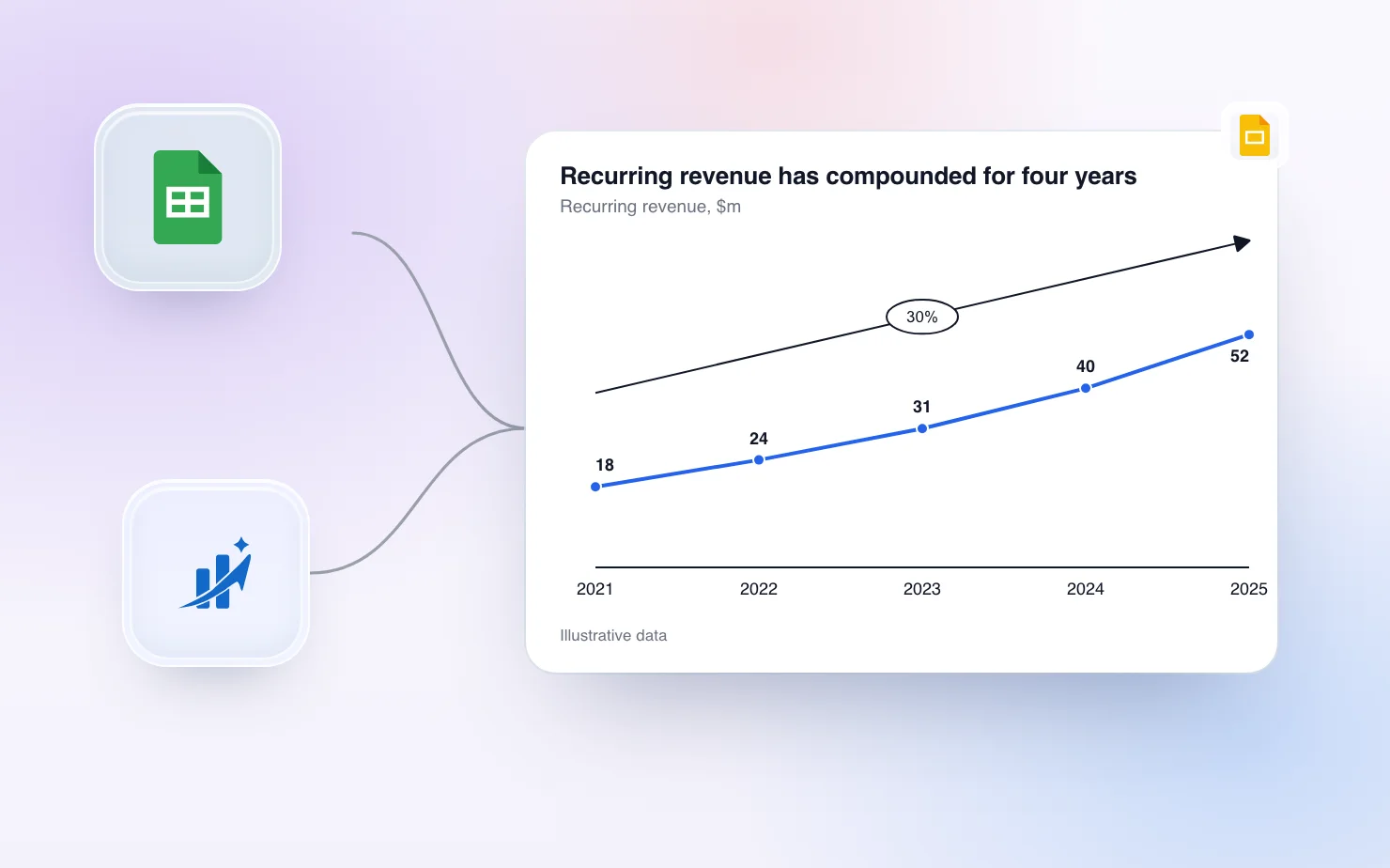
A line chart is the right choice when the audience needs the shape of change over time, and the shape is the message. Revenue growth, churn drifting down, a forecast that bends away from plan. If the point is comparing sizes at one moment, use bars. If the point is composition, use stacked bars. Everything else about a good line slide follows from that first decision.
This guide covers when a line chart earns its place, how to build one in Google Slides with the native tools and where they stop, and how to get a line chart onto a slide with a labelled last value, a growth callout and a dashed forecast. It ends with how ChartKit Chat and the Claude connector can build and edit the chart for you.
When a line chart is the right chart
Use a line when time runs along the horizontal axis and the viewer should see direction, speed and turning points. A line connects values, so it tells the reader that what lies between two points is a continuous path. That is true for monthly revenue and false for four unrelated regions, which is why regions belong in bars.
The data usually tells you which chart it wants.
- One metric over time. A line, with the last value labelled.
- Two or three metrics over time on the same unit. A line chart with direct labels, or one highlighted line and the rest in grey.
- A volume and a rate over time. Bars for the volume and a line for the rate on a secondary axis. More on that below.
- A volume where the filled area helps the reader feel the size. An area chart, with the baseline at zero.
- A start value, an end value and what drove the change. A waterfall, not a line.
Quarterly or yearly points with big swings usually read better as bars. Daily or weekly data with a trend to show is where a line works best.
Building a line graph in Google Slides the native way
Slides has no drawing engine of its own for charts. Every native chart comes from Google Sheets, so the process is always the same.
- In Slides, choose Insert, Chart, Line. Slides creates a linked Google Sheet and drops a sample chart on the slide.
- Click the chart and choose Open source. Replace the sample numbers with your own in the sheet.
- In the Sheets chart editor, use Customize to change series colors, line thickness, point size and the axis range.
- Back in the deck, press Update on the chart to pull the new numbers.
The chart editor in Sheets also offers a smooth line, a combo chart and an area chart as chart types, and a trendline option on a series. For a plain trend slide that is often enough, and it costs nothing. The guide to charts in Google Slides covers the full native workflow, and the guide on linking charts to a sheet explains what Update does and does not refresh.
A secondary axis, natively
A secondary axis lets two series with different units share one chart, such as revenue in millions and margin in percent. In the Sheets chart editor, choose a combo chart or any chart with several series, open Customize, Series, select the series and set its axis to Right. Then check the right axis range, because Sheets picks one automatically and an unlucky range can make the line cross the bars for no reason.
Where the native chart runs out
The native line chart does the basics. The limits show up when you build an exhibit rather than a chart.
- No callouts. There is no delta between two points and no growth-rate arrow. People draw both by hand with text boxes and lines, and they drift when the data moves.
- Direct labels are a manual job. The default is a legend. Labelling only the last value, which is what most business lines need, means data labels on every point or a text box laid over the chart.
- Dashes apply to a whole series. A forecast needs its own series, which is true in every tool. The native editor makes you build that in the sheet.
- The chart lives in Sheets. Editing means opening the source, and the slide keeps a picture until someone presses Update.
If the slide is a simple trend, stay native. If it is the slide the room will argue about, the next section is for you.
Design rules that matter more than the tool
These hold in Slides, in Excel and on paper.
Keep the number of lines low
ChartBuddy's own line chart page recommends capping a line chart at four or five lines. Fewer is better when the message is about one of them. Past a handful the lines cross, the legend turns into a lookup exercise and nobody reads the chart.
Label the line, skip the legend
A legend makes the reader look away from the data, find the color and look back. Put the series name at the end of the line, or drop a label on the line itself. In ChartKit you can set the legend to none and label the last point instead. For the label mechanics, see the guide to data labels in Google Slides charts.
Highlight one line and grey the rest
If the message is "our line against the market", color ours and make the others grey. The viewer then knows where to look before reading a single word. In ChartKit you set the colors by hand, or ask Chat or the Claude connector to highlight a series, which keeps that line in the brand color and greys the others.
Mark the last value
Most decisions on a trend slide are about where the line ends up. Label the final point with its value and leave the earlier points unlabelled. In ChartKit, switch on point labels, then select the ones you don't want and press Delete. A deleted label stays recoverable as a ghost in the editor, so nothing is lost by tidying.
Axis start
A bar must start at zero, because its length is the data. A line is read by position and slope, so it does not have to. If values sit between 90 and 100, a zero baseline flattens the story into a ruler. The risk is the opposite one, a truncated axis that makes a small move look dramatic. The habit that keeps it honest is to show the axis labels whenever the baseline is not zero. When Claude builds a line through ChartKit and the values all sit in the upper half of the range, ChartKit starts the axis just below the data on round tick values instead of at zero.
An area chart is different. The fill is a shape, so its baseline must be zero. If your fill needs a truncated axis, switch to a plain line.
Dashed lines mean forecast
Readers treat solid as actual and dashed as expected. Build the forecast as its own series, repeat the last actual value as its first point so the two lines join, and leave the earlier cells of the forecast series empty. ChartKit treats a blank cell as a gap and not as a zero, so the forecast starts where you want it to. Then set the line style on the forecast series to dashed.
Put the takeaway in the title
"Revenue by year" describes the chart. "Recurring revenue has compounded for four years" tells the room what to conclude. If the line has one message, write it as the title and let the chart prove it.
Building the same chart in ChartKit
ChartKit draws a line chart on the slide itself, and the chart stays editable. The result is a high-resolution image on the slide with the chart model stored behind it, so you or a colleague with the extension can reopen it and change the data or the styling.
- Open ChartKit in Slides and choose Line Chart from the starters.
- Paste or type your data in the data grid, or connect the chart to a range in Google Sheets. With a connected range, the chart redraws when the numbers move and your labels and annotations stay in place.
- Click the line to set its color and line style, including dashes and width.
- Add the callouts. A delta measures the change between two points and shows it as an absolute number or a percentage. A CAGR arrow shows the compound growth rate between two points, and it only applies across yearly categories. For months and quarters use a delta.
- Switch off the legend, label the last point and write the title as the takeaway.
- Apply the chart to the slide.
The points on a ChartKit line are small markers. You can change their roundness from a circle to a square. Series colors, line width and dash all live under the line style, so a forecast series is two clicks once it exists in the data.
Area charts
An area chart in ChartKit is a line chart with area fill switched on. The Area Chart starter is exactly that. Each series fills toward the baseline with its own color at half strength by default, and you can set a different fill color per series. The biggest series is painted first, so a smaller series is not hidden behind a taller one.
Bars and a line on a secondary axis
ChartKit can turn one or more series of a stacked or clustered bar chart into a line, and switch on independent scales so those lines get their own value axis on the right. That covers the common business combo, such as revenue as bars and margin as a line. It works on bar charts, not on a plain line chart, so start from a clustered bar and flip the series.
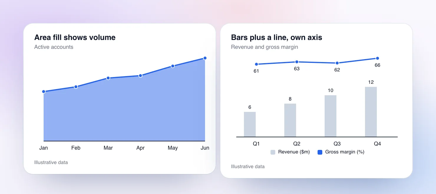
The picture shows an area chart on the left and a combo on the right, drawn from the same engine. The data is illustrative.
ChartBuddy documents similar controls. Its combo chart page describes a dual-axis control, and its help page for secondary axes explains moving a series to the right axis from the series toolbar. Its line style help page describes a dashed stroke. If you already use ChartBuddy for those, nothing in this section should push you off it. The differences in ChartKit are the CAGR and delta callouts on the line, the live Sheets link, and the chat, which we get to next. For a longer comparison, see ChartKit vs ChartBuddy.
Let Claude do the building
Everything above can be done by hand in a few minutes. If you would rather describe the chart, ChartKit has two routes that use Claude.
ChartKit Chat, docked in Slides
ChartKit Chat is a chat panel docked inside Google Slides, and it works on the deck in front of you. It runs on the Claude subscription you already have, through ChartKit Desktop on your machine, and it also works with Codex. Teams can instead point it at a model endpoint their admin has set up. ChartKit does not resell model usage. Chat is a Pro feature, and there is a free Pro trial.
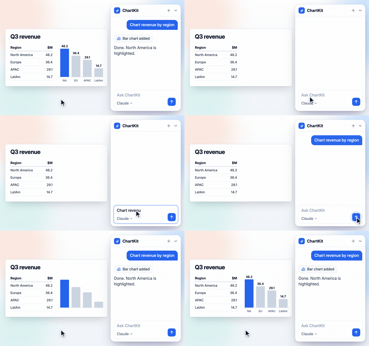
The first time, Chat asks permission to edit the deck. After that you can ask in plain language. These are the things it can do today.
- Build a trend chart from pasted data. Paste a table into the chat and ask for a line chart. It inserts an editable ChartKit chart on the current slide. Ask for a different chart type and it swaps the chart in place.
- Add the callouts. Ask for a CAGR arrow across the years or a delta between two points. Chat can build the chart with those annotations, or add them to a chart that is open in the editor. Keep the yearly rule in mind, since a CAGR needs yearly categories.
- Change a chart that is open. With a chart open in the ChartKit editor, Chat can read its data and settings, rebuild it from new inputs or apply precise edits to a single property, such as a color, a label or the legend.
- Write the takeaway. Chat can write text into a selected text box or shape, so "rewrite this title as the finding" works on the title above your chart.
- Place saved components and layouts. If you saved a source footnote or a branded layout, Chat can place it. That is useful when every trend slide ends with the same footer.
For text, ChartKit also has a writing pill that appears next to a selected text box. Its actions are Write, Improve, Shorten and Action title. A result card lets you re-run it as Shorter, Longer, Formal or Casual, then replace the text or insert below. Action title rewrites a sentence as a consulting-style takeaway, one sentence with a verb. It is the quickest fix for a title that only names the chart.
Chat has limits worth knowing. It needs ChartKit Desktop running for the Claude or Codex route, and it asks for the deck permission before it edits anything. It is also an assistant that works at your request, so read the result before the meeting.
The ChartKit connector for claude.ai
The second route starts in claude.ai. Add the ChartKit connector from getchartkit.app/mcp, ask Claude for a chart, and it draws the chart with the same engine as the extension, in your saved palette. Line charts are one of the types it can draw. Claude highlights the series you care about and, when a callout is the obvious story, adds one, such as a CAGR across years or the change from first to last point.
From there, you can click Insert into Slides, or ask Claude to insert it into the deck you have open. The chart lands as an editable ChartKit chart, so you can still open it and change it in the extension. The connector is part of Pro. The longer walkthrough is in the AI chart generator guide.
Where line charts show up in a finance deck
A board pack uses line charts for ARR, cash balance, headcount and margin over time, and almost always puts a delta or a CAGR on at least one of them. The FP&A board chart playbook shows where lines sit among the bridges and stacked bars of a monthly pack. If you rebuild these lines every month, connect them to a Sheets range once and let the numbers flow in.
Which route to take
Use the native Slides line chart when the slide is a simple trend and nobody will ask a follow-up. Move to ChartKit when the slide needs a labelled end value, a growth callout, a dashed forecast or a line that has to stay editable on the slide. Use Chat or the connector when you would rather describe the chart than click through it. The Free plan covers 10 charts a month, and Pro is €10 a month.
Download and try ChartKit for free and build the line chart you rebuild most often. The line chart page shows what it looks like.