
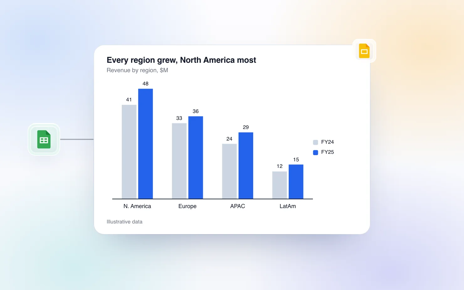
Use a clustered bar chart when the reader has to compare series with each other inside every category. Actual against budget by region, this year against last year by product, three scenarios by quarter. The bars sit side by side on one baseline, so the eye can judge the gap between them without any arithmetic.
If the reader needs the total or the mix instead, it is the wrong chart. This guide covers when to pick it, how to build one in Google Slides through Sheets and where that route runs out, how to build one natively in Slides, and how to let an AI do the build.
Clustered, stacked or 100% stacked
The three charts use the same data table and answer three different questions. Pick by the question the slide has to answer.
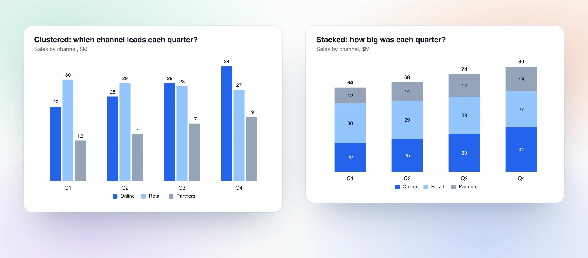
Clustered answers "which one is bigger, and by how much". The bars start at the same baseline, so the reader compares lengths directly. It fits actual against plan, year against year, and any case where the series are peers rather than parts of a whole. Its weak spot is the total. Nobody can add up three bars in their head, so if the total matters, add it to the title.
Stacked answers "how big is the whole, and what is it made of". Only the bottom segment sits on a baseline, so comparing the middle and top segments across categories is hard. Use it when the series are parts of one total. The data labels guide covers putting totals on top of the stack.
100% stacked answers "how is the mix changing", and hides the total on purpose. It has its own guide, how to make a 100% stacked bar chart in Google Slides.
A quick test. If the slide title would say "A is ahead of B", use clustered. If it would say "the total grew and most of it came from C", use stacked. If it would say "C's share doubled", use 100% stacked.
Two cases where clustered is also wrong. One series only means a plain bar chart, and the clusters add nothing. Time series with many periods usually read better as a line, because twelve clusters of two bars is a lot of ink for a trend.
ChartBuddy's definition page lists the same uses and says to limit a clustered bar to three or four series, and ChartBuddy is right about that limit. Its help docs also describe a one-click switch between clustered and stacked in the chart type selector. That is worth knowing, because it is easier than ChartKit's route (more on that below).
Build it in Google Sheets and insert it into Slides
Slides borrows all of its charts from Sheets, so this is the supported native route.
- In Google Sheets, lay the data out with categories in the first column and one column per series. The header row holds the series names.
- Select the range and choose Insert, then Chart.
- In the chart editor, set the chart type to Column chart for vertical bars or Bar chart for horizontal bars. With more than one data column, Sheets draws the series side by side by default. Check that Stacking is set to none under Customize, then Chart style.
- Under Customize, then Series, set a color for each series. This is also where you tick Data labels to print values on the bars.
- In Slides, choose Insert, then Chart, then From Sheets. Pick the chart and keep Link to spreadsheet ticked so an Update button appears when the sheet changes.
The full walkthrough of the linking step and how to create charts in Google Slides cover the details.
Where the native route runs out
- The chart lives in a second file. Every edit means going back to Sheets, changing the data or the styling there, and clicking Update in Slides.
- The series order follows the column order in the sheet. To reorder the bars or sort the categories, you reorder the data.
- Highlighting one series means recoloring it in the Series section and greying the rest by hand, again for each chart.
- You can't drag a label or add a callout on the slide. Annotations like a delta between two bars happen in a text box you place yourself.
For a single chart you won't revisit, none of that matters. For the same chart every quarter, it adds up.
Build it natively in Slides with ChartKit
ChartKit is a Chrome extension that draws the chart on the slide, in your palette, and keeps it editable. Clustered bar is one of the native chart types.
- Open ChartKit from the Slides sidebar and pick Clustered bar, or press Alt+C for a new clustered bar chart.
- Paste your table into the data grid. Categories down the first column, one column per series.
- Check the labels. The Values button in the chart toolbar turns the numbers on the bars on and off.
- Insert it. The chart is an image on the slide with the data stored behind it, so you or a colleague with the extension can reopen it and keep editing.
To keep the chart current from a sheet, use the Data button in the toolbar and link a Google Sheets range. The chart then re-renders when the numbers change, and the labels and colors you set stay. The live sync post explains it and every way to keep a Slides chart current compares it with native linked charts.
The controls a clustered bar needs
- Gap between clusters. Select a bar and drag the grip on the side of the cluster to widen or narrow the gap between categories.
- Gap inside a cluster. The series popup has a Cluster gap field for the space between bars in the same group.
- Horizontal bars. The Rotate axis button in the chart toolbar flips the chart. It is available on clustered, stacked and 100% stacked bars and on waterfalls. Rotate before you add callouts, because a chart that already has annotations can't be rotated.
- Sort. Right-click a bar and choose Sort categories high to low, or low to high. It sorts by the series you clicked.
- Highlight. Click a series and change its color. One series in the brand blue and the rest in grey is the clearest version of the chart.
- Callouts. Deltas, CAGR arrows, reference lines and axis breaks attach to a bar and move with it.
One difference from ChartBuddy is worth stating plainly. In the ChartKit editor there is no single control that flips an existing chart between clustered and stacked. You either start a new chart of the other type, or ask the ChartKit Chat to change the chart type, which keeps your data. ChartBuddy's help docs describe a chart type selector in the title bar that does it in one click. If you flip between the two views often, that is a point in ChartBuddy's favor.
Design rules for a clustered bar
Keep it to three or four series. Every extra series thins every bar and adds a color to the legend. If you have six, you probably have two charts.
Order series the same way in every cluster, and put the one the reader cares about first or last. The reader learns the pattern from the first cluster and then reads the rest by position. A consistent order also makes the legend optional.
Sort the categories when the ranking is the point. Sort by the series that matters, high to low, and the chart reads as a ranking. Keep chronological order for time periods and for categories with a natural order like age bands.
Make the gap between clusters wider than the gap inside one. The bars of one category should read as a group. If the space between clusters is the same as the space between bars, the groups dissolve.
Label the values or keep the axis, not both. On a chart with a handful of bars, value labels on the bars do the job and the axis is noise. Use the axis when there are too many bars to label. The data labels guide goes deeper.
Highlight the series that carries the message. Color the series the slide is about in your brand blue and grey out the rest. Four saturated colors tell the reader nothing about where to look. The title should name the finding, for example "Every region grew, North America most", not "Revenue by region".
Go horizontal for long category names or a ranked list. Rotated bars give the labels room to sit on one line and put the biggest value on top.
Let the ChartKit Chat build it
ChartKit Chat is a chat docked inside Google Slides. It runs on Claude, using your own Claude subscription through ChartKit Desktop, so ChartKit does not resell model usage. Teams can instead point it at a model endpoint their admin sets up. It works on the deck in front of you, which means it can read the slide, see the table you pasted and write back into the same deck. It is part of Pro, with a free Pro trial.
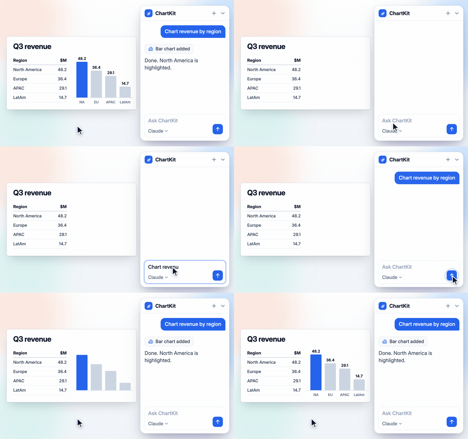
That recording shows a single-series bar, but the flow is the same for a clustered one. A prompt that works on a slide with a table on it.
Chart this as a clustered bar, FY24 against FY25 by region. Highlight FY25 and keep FY24 grey. Sort the regions by FY25.
What the chat can do from there, all of it on the live deck.
- Insert an editable chart. It builds a ChartKit chart from the table, with the type, unit, sort and highlight you ask for, and places it on the slide. The chart stays editable, so every control above still works.
- Change a chart that is already on the slide. Ask it to switch the chart type, change the numbers, or highlight a different series. It swaps the chart in place.
- Rewrite the slide title as a takeaway. Ask for the title as an action title, so "Revenue by region" becomes a sentence that says what the chart shows.
- Use your own data tools. Chat can use the MCP connectors you have set up, such as a data warehouse, to pull the numbers before it draws the chart.
The rewriting tools
Chat is one half of the AI side. The other half is the writing pill. Select text in a Slides text box or in Docs and a spark button appears. Its command bar offers Improve, Shorten, Action title and Write, plus a free prompt. The result streams into a preview card with a word-count change and a Changes view, and you choose Replace or Insert below. On a result you can ask for Shorter, Longer, Formal or Casual and it re-runs on the current text.
Action title is the one that matters on a chart slide. Select the title, run it, and read the diff before you accept.
Ask Claude in claude.ai instead
If you work in claude.ai, the ChartKit connector gets you to the same chart from the other side. Ask Claude for a clustered bar from a table, and the chart shows up in the conversation with Insert into Slides and Edit buttons under it. Insert puts it on your open deck as an editable ChartKit chart. Claude can also change the chart afterwards, for example to a different type, a sort or a highlight, and the slide refreshes. The connector is a Pro feature. Charts in Claude and ChatGPT for Google Slides has the full setup.
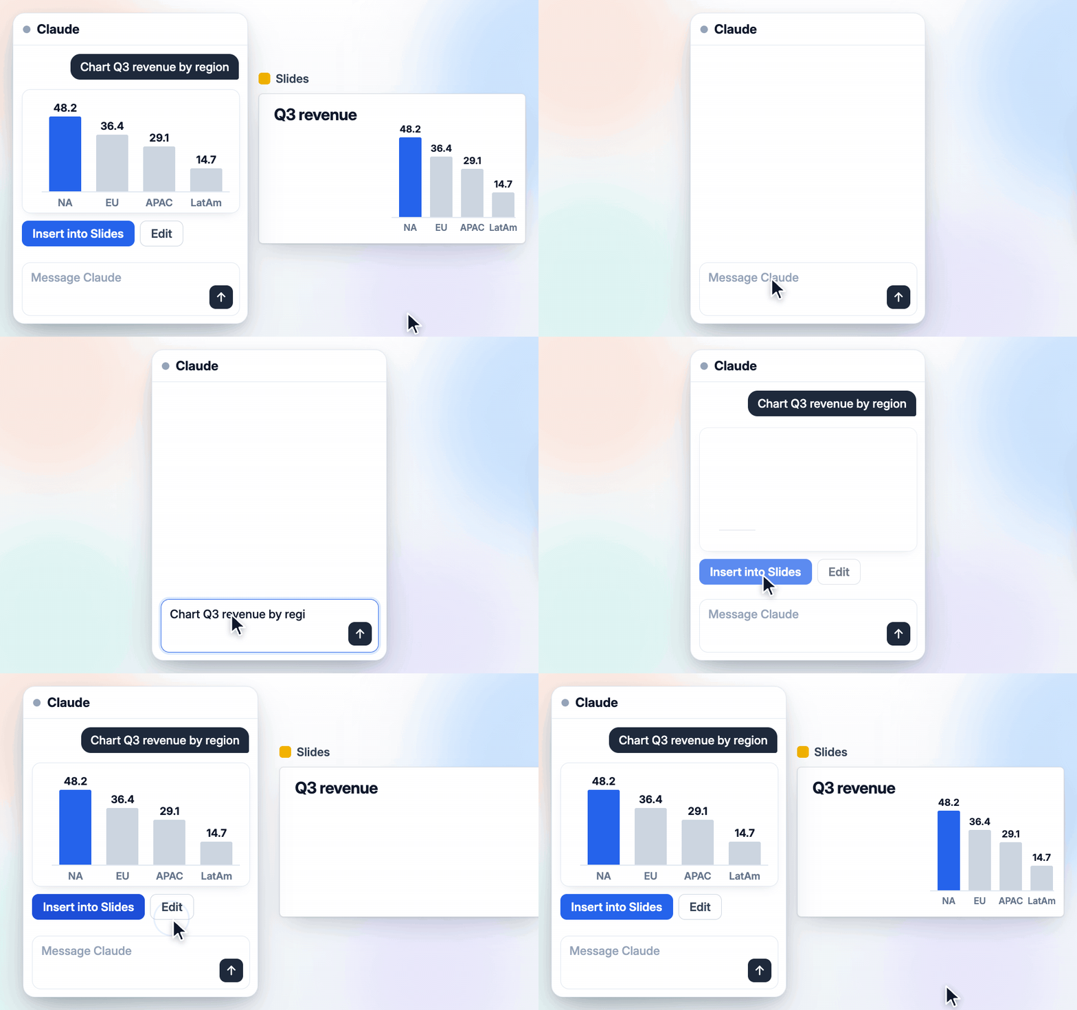
The AI route does not change what makes the chart good. The six design rules above still apply, and the chat follows them better when you state them in the prompt. Name the series to highlight, the sort and the finding the title should carry.
Common questions
How do I make a clustered bar chart in Google Slides? Build it in Google Sheets with Insert, then Chart, using one data column per series, and insert it into Slides from Insert, Chart, From Sheets. Or draw it directly on the slide with ChartKit.
What is the difference between a clustered and a stacked bar chart? Clustered puts one bar per series side by side in each category, so you compare series. Stacked piles the series into one bar per category, so you read the total and the mix.
Is a grouped bar chart the same as a clustered bar chart? Yes. The two names mean the same chart.
How many series can a clustered bar chart hold? Three or four. ChartBuddy's guide gives the same limit. Past that, split the chart or highlight one series.
Can a clustered bar chart be horizontal? Yes. Pick Bar chart in Sheets, or use Rotate axis in the ChartKit toolbar.
Can ChartKit Chat build a clustered bar chart for me? Yes. Paste a table or point it at the data on the slide and ask. It runs on your own Claude subscription and is part of Pro, with a free Pro trial.
If you rebuild the same comparison chart every quarter, try ChartKit for free. The Free plan gives you 10 charts a month with every chart type and no card required.