
How to add data labels to a chart in Google Slides
6 min read
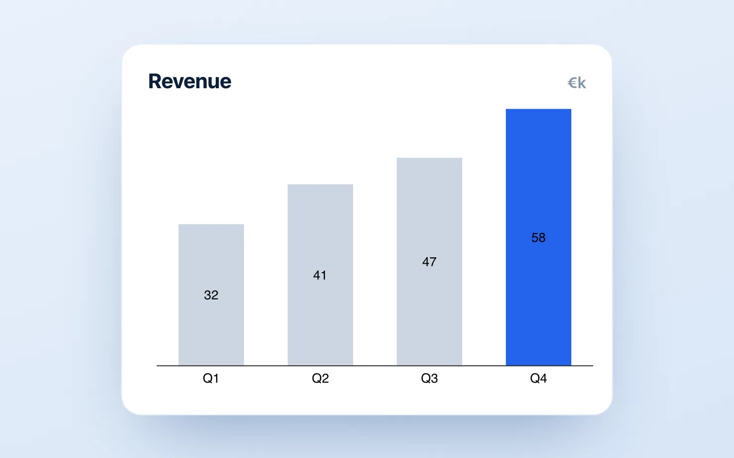
A chart without numbers on it is a decoration. The moment a chart lands in a board deck or a client read-out, someone asks "what's that bar worth?" — and if the answer isn't printed on the bar, the chart has failed its one job. Yet adding clean data labels in Google Slides is one of those tasks that looks like it should take ten seconds and somehow eats ten minutes.
The reason is structural: Google Slides has no real charting engine of its own. Every "chart" in Slides is either a picture you drew, or a chart piped in from Google Sheets — and the labelling controls live back in Sheets, several clicks away from the slide you're actually editing. This guide covers the three honest ways to get data labels onto a Google Slides chart, and exactly where each one stops being worth it.
What "good" data labels actually means
Before the methods, a definition check, because "data labels" covers more than a single number stuck above a bar. A management-grade chart usually needs some combination of:
- Value labels — the raw number on each bar, point, or slice
- Segment labels — a number inside each piece of a stacked bar, not just the total
- Total labels — a bold sum sitting above the whole stack
- Percent-of-total or share labels — for 100% stacks, donuts, and Mekkos
- Delta and growth labels — "+12%", "▲ 4.2", or a CAGR across the series
Google's native tooling handles the first one passably and the rest badly or not at all. Keep that list in mind — it's the difference between a chart that answers questions and one that creates them.
Method 1: The Google Sheets chart editor (native, limited)
If your chart was inserted via Insert → Chart → From Sheets, the labels live in Sheets:
- Open the source Google Sheet (or double-click the chart and choose Open source).
- Click the chart, then the three-dot menu → Edit chart.
- In the Chart editor, go to the Customize tab → Series.
- Tick Data labels. For totals on a stacked bar, also tick Total data labels.
- Adjust font, position, and number format under the same panel.
- Back in Slides, click the chart and hit Update so the new labels flow through.
Where it breaks down:
- Stacked segment labels are unreliable. Sheets will happily show a total, but getting a clean number inside every segment of a stacked or 100% stacked bar is fiddly and often just refuses on small segments.
- No deltas, no growth, no CAGR. There is simply no native control for "+12%" between two bars. Those are the labels boards actually care about.
- The round-trip tax. Every label tweak means jumping to Sheets, editing, returning to Slides, and clicking Update. Do that across a 20-slide monthly deck and the minutes add up fast.
- Formatting drift. Label number formats don't always inherit your slide's currency or decimal conventions, so you end up fixing
1500to$1.5Kby hand.
For a single internal chart with one series, the native route is fine. For a recurring reporting deck, it's the part everyone quietly dreads.
Method 2: Manual text boxes over a chart image (free, painful)
The fallback everyone discovers eventually: screenshot or draw the chart, then drop Insert → Text box on top of each bar and type the numbers yourself.
It works, and it gives you total visual control. It also has two fatal flaws:
- It doesn't survive a data change. The day the numbers update — and they always do — every text box is now wrong and in the wrong place. You re-do all of them by hand.
- Alignment is a job. Getting fifteen labels pixel-aligned to fifteen bars, then keeping them aligned when the slide is resized, is its own small misery.
Use this only for a true one-off — a single chart, on a single slide, that will never change. The moment "monthly" or "quarterly" enters the conversation, manual labels become a standing liability.
Method 3: Charts where labels are part of the chart (the add-on route)
The structural fix is to use a chart that treats labels as data, not decoration — which is what a dedicated charting add-on like ChartKit does directly inside Google Slides. Because the label belongs to the bar, segment, or series, three things change:
- Every label type is a toggle, not a workaround. Value labels, per-segment labels, bold totals above the stack, percent-of-total for 100% stacks and donuts, and delta/CAGR annotations between bars — each is a switch on the chart, not a hand-placed text box.
- Labels move with the data. Change a number and the label updates, repositions, and re-formats itself. No round-trip to Sheets, no realigning.
- You edit on the slide. Labels are styled where the chart lives, so currency, decimals, and number scale match the deck by default instead of by manual correction.
That's the whole pitch: the labels boards ask for — segment numbers, totals, and growth deltas — are exactly the ones the native route can't do, and exactly the ones that should never be hand-placed text.
Quick reference: what each method can label
| Label type | Sheets editor | Manual text boxes | Charting add-on |
|---|---|---|---|
| Single value per bar | ✅ | ✅ (until data changes) | ✅ |
| Inside-segment labels (stacked) | ⚠️ unreliable | ✅ (painful) | ✅ |
| Bold total above the stack | ⚠️ basic | ✅ (painful) | ✅ |
| Percent of total (100% / donut) | ❌ | ✅ (painful) | ✅ |
| Delta / growth / CAGR between bars | ❌ | ✅ (painful) | ✅ |
| Survives a data update | ✅ | ❌ | ✅ |
The bottom line
If you need one number on one bar, the Google Sheets chart editor will get you there — open the source, tick Data labels, and update the chart in Slides. If you need segment labels, totals, percentages, or growth deltas — the labels that make a chart board-ready — the native tooling runs out of road, and hand-placed text boxes turn every data refresh into rework.
The durable answer is to stop treating labels as something you add on top of a chart and start using charts where the labels are part of the model. That's the difference between labelling a chart once and re-labelling it every reporting cycle.
Download and try ChartKit for free — 10 charts a month on the Free plan, no card required.