
How to insert a Google Sheets chart into Google Slides (2026)
5 min read
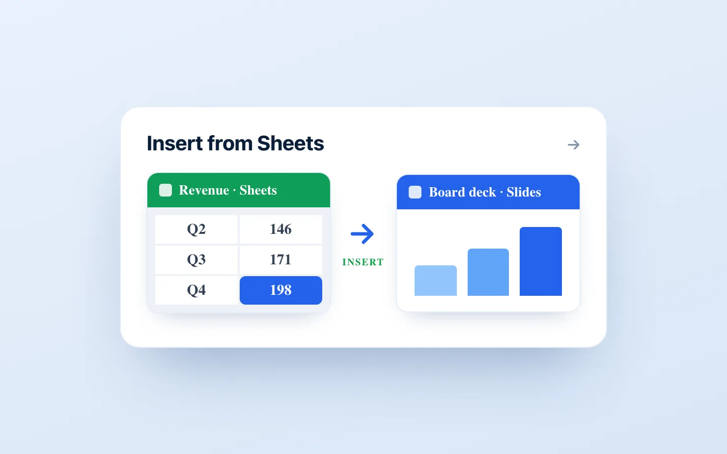
You have the numbers in a Google Sheet and you need the chart on a slide. The real question is not just how to get it there once, but how to get it there so it still looks right and stays correct when the data changes next week. This is the honest map of every way to do it, starting with the built-in method most people reach for first, and ending where each one runs out of road.
The native way, step by step
Google Slides can pull a chart straight from a Google Sheet, and this is the right starting point because it is free and takes about thirty seconds.
- Open your slide and go to Insert → Chart → From Sheets.
- Pick the spreadsheet that holds your data.
- Choose the specific chart from that sheet and click Import.
Slides drops in the chart as a linked object. Because it is linked, an Update button appears on the chart whenever the source data in the sheet changes, and one click re-pulls the latest numbers. For a simple column, bar, line, or pie chart that a colleague will glance at once, this is genuinely all you need.
The reason to start here is honesty. If the native path covers the job, you should not install anything.
Where the native chart stops being enough
The built-in link is fine until the chart has to carry a story or look like it belongs in a management deck. Three walls show up quickly.
The chart types are thin. You get the standard column, bar, line, and pie. There is no waterfall, no Mekko, no stacked bar with clean segment labels. The moment you need a variance bridge or a 100% stacked bar, the native tool has nothing for you. We walk through this gap in detail in the Google Slides waterfall chart guide.
The styling controls are minimal. No deltas between bars, no totals on top, no annotations, no dashed "target" segment, no axis break for the chart where the interesting movement is 4% of the bar height. In other words, the exact controls that make a consultant chart readable are the ones you do not get. See how to add data labels to a chart in Google Slides for what the native tool leaves out.
Every edit is a round trip. You cannot restyle a linked chart inside the slide. To change almost anything you jump back into Google Sheets, edit there, return to the slide, and click Update. For a deck you rebuild every reporting cycle, that friction adds up fast.
The trap most people fall into next
When the native chart is not good enough, the common workaround is to build a nicer chart somewhere else, screenshot it, and paste the image onto the slide. It looks great for exactly one week.
The moment a number moves, the image is quietly wrong, and there is no link to update. You are back in the source, re-exporting, re-cropping, re-pasting, on every chart, every cycle. This is the screenshot loop, and it is the single biggest time sink in recurring reporting. If you want the chart to stay live, an image is the one option to rule out.
The clean path when the chart has to be board-ready
If you are building the same charts every month and you need them to look sharp and stay current, the better setup is a native charting add-on that keeps the chart as an editable object inside the slide.
This is the job ChartKit was built for. It adds consultant-style charts directly inside Google Slides, so you get waterfalls, stacked bars, 100% bars, and line charts with totals, deltas, labels, and axis breaks, and you edit all of it in the slide rather than round-tripping into Sheets. You can also connect a chart to a Sheets range so the numbers keep flowing through instead of going stale - the details of that are in Slides charts that live-sync with Google Sheets. If your real problem is keeping charts current, the full guide to auto-updating Google Slides charts from Sheets compares every option side by side, including the native link and the Apps Script route.
For a wider look at the tools in this space, the best Google Slides add-ons for consultants and finance teams is an honest roundup, including where competitors are stronger.
So which method should you use?
Use the native Insert → Chart → From Sheets if you need a simple chart occasionally and do not care about styling or storytelling controls. It is free and it is right there.
Never paste a screenshot if the chart has to stay correct. The image cannot update, and the loop it creates will cost you more than any tool.
Use a native charting add-on if you build recurring management charts and want them to look board-ready and follow the data without a rebuild.
Common questions
Can you insert a Google Sheets chart into Google Slides? Yes. Go to Insert → Chart → From Sheets, pick the spreadsheet, and choose the chart. It arrives as a linked object with an Update button that re-pulls the data when the sheet changes.
Does a Google Slides chart update automatically when the Sheet changes? Not on its own. A linked native chart shows an Update button you click manually. If you want the chart to follow the data without that step, the auto-update guide covers the ways to close that gap.
Why does my Google Sheets chart look basic in Slides? The native chart tool only supports a handful of chart types and offers little control over labels, deltas, and totals. For board-grade charts you need an add-on built for it, such as ChartKit.
How do I add a waterfall or Mekko chart from Sheets? The native tool does not support them. You need a charting add-on. Start with the waterfall chart guide.
If the chart you are inserting is one you rebuild every reporting cycle, it is worth setting it up once as an editable object that follows the sheet, rather than re-pasting it every month. That is what ChartKit does, straight from the Chrome Web Store.
Download and try ChartKit for free — 10 charts a month on the Free plan, no card required.