
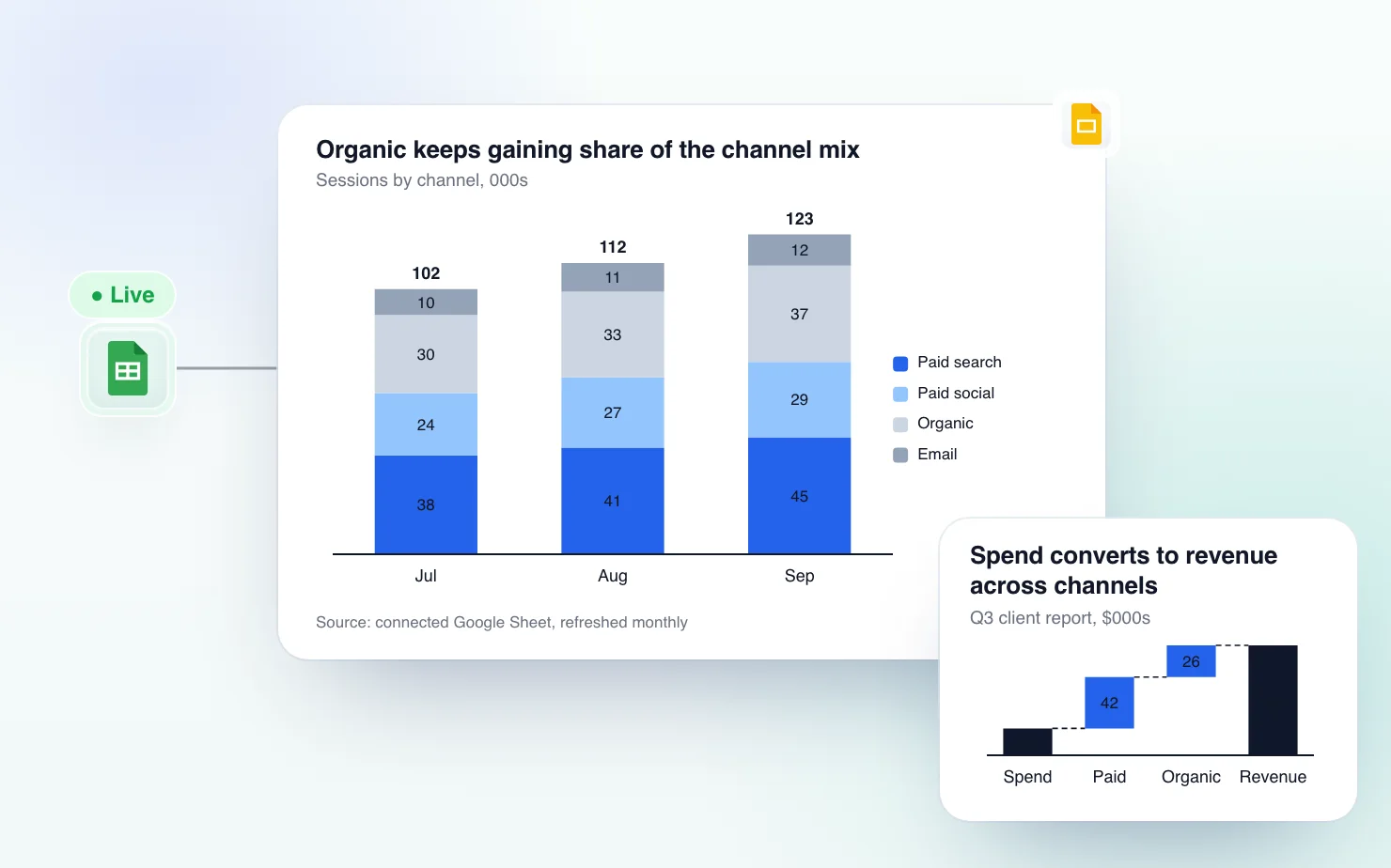
Every agency with more than a handful of clients runs the same routine each month. Someone opens last month's deck, deletes the numbers and rebuilds the same five or six charts with new data. Do that for every client on the roster and a large part of the account team's week goes to redrawing bars that looked almost the same in March and will look almost the same in May.
The charts are not the hard part. A channel mix bar and a spend-to-revenue bridge are simple charts. The time goes because Google Slides remembers none of it. Every native chart starts from the default Sheets palette, which is never the client's brand. Every chart pasted as an image loses its link to the data once the numbers change. And the work usually lands on the most junior person on the account that week.
Below are the charts a marketing report needs, and a setup that lets you build them once per client instead of every month.
The charts that carry a marketing report
Five chart types cover almost every slide in a monthly or quarterly client deck. Give each one a title that states the finding. "Paid social drove 42% of leads, up from 28% in Q1" tells the client something. "Lead source breakdown" doesn't.
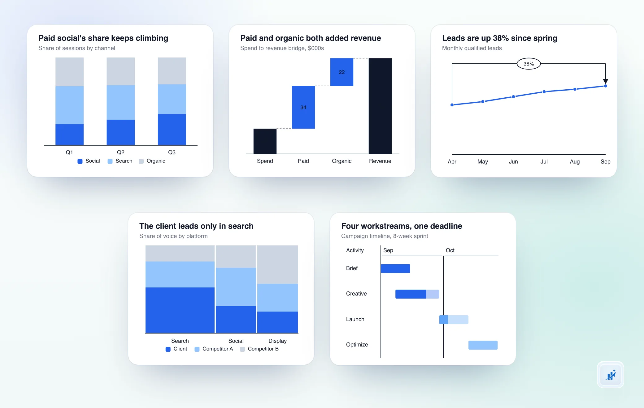
Channel mix
Every client asks for the channel mix slide by name. It shows how the budget or the results split across paid social, paid search, organic, email and the rest. A stacked bar keeps the absolute numbers visible. A 100% stacked bar drops them and shows only how the mix shifts from month to month. If the client cares whether the pie is growing, use the stacked version. If they care whether the mix is shifting, use the 100% version. The 100% stacked bar guide covers when each one applies.
Spend-to-revenue bridge
When a client asks what the extra spend bought, a bar chart leaves them to do the subtraction. A waterfall starts at last period's revenue, steps through what each channel or campaign added or took away, and lands on the current total. The bridge is the analysis. It is also the right chart when you move budget around, because it shows the client where the money went and what moved with it. The waterfall chart guide has the build steps.
Trend with deltas
A bare trend line tells the client whether a number is going up. Add a delta on the last point, or a CAGR arrow across a longer run, and it also tells them by how much and whether that is normal for the account. For a seasonal channel, compare against the same month last year. A YoY delta is usually more honest than a MoM one there. Put the number the client will ask about on the chart so nobody has to read it off the axis.
Share of voice
You'll use this one less than the first three. It is the right chart when a client wants to see how big a channel or market segment is and how the players split inside it. Think total media spend by platform, with the client's share against competitors inside each column. The column width shows the size and the stack shows the split. It's the market map from consulting decks, and it makes a competitive report far easier to read than a table of numbers. The Mekko chart guide explains when it earns its complexity and when a simpler chart says the same thing.
Campaign timeline
Retainer and campaign agencies both end up needing a timeline slide. It shows launch dates, review points and handoffs across workstreams so the client can see the plan at a glance. It's the same slide a product roadmap uses, and you build it the same way. One row per workstream, a time axis across the top and bars sized to the real dates. Hand-placed rectangles drift every time a milestone moves.
One deck per client, not a rebuild every month
The habit around the charts matters more than the chart types. This is the setup that saves the time.
Build the master deck once. Every client gets one presentation with the report structure already in place. Same five chart types, same order, same titles waiting for this month's finding. For a new client you duplicate it. You don't start from a blank slide.
Connect each chart to a Sheets range instead of pasting an image. ChartKit charts can connect to a Google Sheet range and stay in sync. Point a chart at the range once and it re-renders when the data changes, with no rebuild. Labels, totals, deltas and colors stay as you set them. Only the numbers move. The live sync release notes cover what it does. Every way to keep a Slides chart current from a sheet compares it with native linked charts and shows where those fall short.
Refresh on the reporting cycle, not on request. Once the client's source sheet has the month's numbers, refresh each chart or reopen the deck. The new data runs through the whole deck in minutes instead of an afternoon.
Save one brand palette per client. Slides has no idea which client a deck belongs to. Save a palette per client and switch to it before you open their deck. That is the only way to keep every chart on-brand without recoloring bars by hand every month.
Repoint, don't rebuild, for a new client. Duplicate the master deck, then point each chart's Sheets connection at the new client's data. Chart types, titles and formatting carry over. Only the source range changes.
Where this doesn't reach
Neither ChartKit nor Google Slides connects straight to GA4 or an ad platform's API. The data has to land in a Google Sheet first. That can be Google's GA4 Reports Builder add-on for Sheets, a native export from the ad platform, or a connector like Supermetrics for Google Sheets if the team already pays for one. Once the numbers are in a sheet, a chart can point at that range and stay current. Getting the data out of the platforms is still your job.
The second limit is templating across clients. Duplicating a deck and repointing each chart's source range takes a few minutes per new client. It is not an automatic rollout across clients. An agency with twenty accounts does twenty repoints the first time, then just a refresh every cycle after.
Common questions
Which chart types matter in a marketing agency's client report? Five cover almost every monthly report. A channel mix chart (stacked bar or 100% stacked bar), a spend-to-revenue bridge (waterfall), a trend line with month-over-month or year-over-year deltas, a share-of-voice chart (Mekko) and a campaign timeline (Gantt).
Can a Google Slides chart connect directly to GA4 or an ad platform? No. The data has to land in a Google Sheet first, through the GA4 Reports Builder add-on, an ad platform export or a connector like Supermetrics. From there a chart can point at that sheet and stay current.
How do agencies stop reformatting the same charts every reporting cycle? Connect the chart to a Sheets range once instead of pasting a static image. The chart re-renders when the numbers move, and labels, totals, deltas and colors stay as you set them. The monthly job is updating the sheet and hitting refresh.
How do you keep each client's report on-brand? Save a palette per client and switch to it before you open that client's deck. Without it, every chart uses whichever colors were last active.
If your team rebuilds the same client charts every reporting cycle, try ChartKit for free. The Free plan gives you 10 charts a month with every chart type and no card required.
Running reports across a whole client roster? Talk to us about team access and roll it out to the account team once instead of one install at a time.