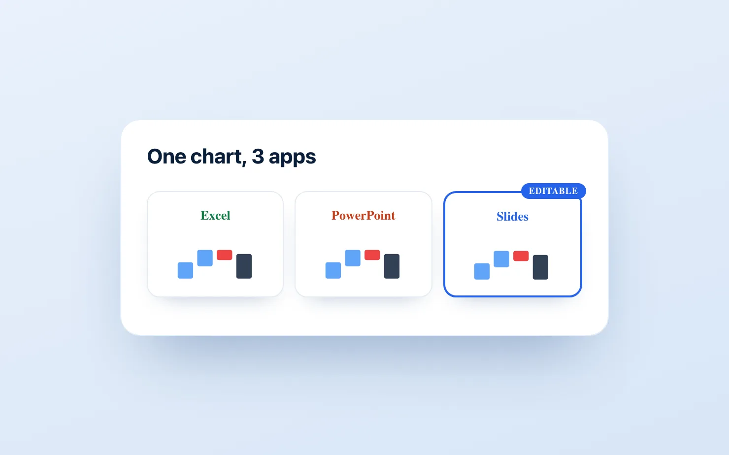
The waterfall chart — also called a bridge or a walk — is the workhorse of business reporting: revenue bridges, cost walks, EBITDA bridges, headcount waterfalls. Every platform claims to support it; each one fails in a different place. This guide gives the step-by-step method for Excel, PowerPoint, and Google Slides, with the honest limitation of each, so you can stop fighting your tool's particular weakness.
First, the anatomy
A correct waterfall has: floating bars that start where the previous bar ended; total/subtotal bars that drop to the baseline; connector lines between bars; consistent color logic (one color up, one down, neutral for totals); and value labels on every bar. Most native tools fail on the subtotal or connector point — keep score as we go.
Excel (the best native implementation)
Excel has had a real waterfall type since 2016, and it's the strongest of the three.
- Lay out two columns: labels and values (decreases as negatives). Include rows for subtotals/totals.
- Select the range → Insert → Charts → Waterfall.
- For each total bar: double-click the bar → tick Set as Total. This is the step everyone misses — totals otherwise float like ordinary movements.
- Adjust the Increase/Decrease/Total fill colors via Format Data Series (the defaults are not boardroom material).
Limitations: connector lines can't be styled much, data labels inside narrow bars overflow awkwardly, and there's no built-in delta or CAGR annotation — you add those as drawing objects that detach from the chart when it moves. Verdict: genuinely usable for analysis; needs manual polish for a board deck.
PowerPoint (good chart, wrong place to edit data)
PowerPoint uses the same chart engine as Excel:
- Insert → Chart → Waterfall. An embedded Excel sheet opens for the data.
- Enter labels and values; right-click each total bar → Set as Total.
- Style via the Format pane as in Excel.
Limitations: the embedded-sheet editing flow is clumsy for recurring updates, and the polish gap is the entire reason think-cell exists — its waterfall (automatic labels, deltas, connectors, CAGR arrows in seconds) is the professional standard, at roughly €600/user/year. If you're in PowerPoint with budget, think-cell remains the answer; that's not our market and we won't pretend otherwise. On Google Slides, the honest tool-by-tool breakdown is in our think-cell alternative comparison.
Google Slides (the weakest native path)
Google Slides has no waterfall of its own; you embed one from Sheets:
- In Sheets: labels and values in two columns → Insert → Chart → type Waterfall.
- In Slides: Insert → Chart → From Sheets, link the chart.
Limitations — and they're structural: the Sheets waterfall handles intermediate subtotals poorly, connector and label control is minimal, and every edit means a round trip into Sheets. The common workaround — a stacked bar with a transparent base segment, plus hand-drawn connectors — takes 15–30 minutes per chart and breaks on every data update. We've written a dedicated deep-dive on the Google Slides methods if this is your platform.
Platform scorecard
| Excel | PowerPoint | Google Slides (native) | |
|---|---|---|---|
| Real waterfall type | ✅ | ✅ | Sheets-embed only |
| Proper subtotals | ✅ (Set as Total) | ✅ | ❌ |
| Connector control | Limited | Limited | ❌ |
| Deltas / CAGR annotations | Manual | Manual (or think-cell) | Manual |
| Recurring-update friendliness | ✅ | Clumsy | ❌ |
| Pro-grade add-on available | think-cell | think-cell | ChartKit / ChartBuddy |
When the native tool isn't enough
The pattern across all three platforms: native waterfalls are fine for a one-off, and painful for recurring reporting — the monthly variance bridge, the quarterly ARR walk. That's when dedicated tools earn their keep:
- On PowerPoint: think-cell is the standard.
- On Google Slides: native add-ons close the same gap — ChartKit (€8/mo, 14-day free trial: waterfall, stacked bar, 100% bar, line, with totals, deltas, annotations and axis breaks built in, editable in the deck) or ChartBuddy (~€10/mo, broader chart library). think-cell has no Google Slides version, so on this platform "use think-cell" means pasting screenshots — which dies the first time the data changes.
A reasonable rule: if you build the same waterfall more than four times a year, the tooling pays for itself in the first month.
Common questions
Why don't my total bars touch the baseline in Excel? You skipped Set as Total. Double-click the specific bar (two single clicks), then tick the box in Format Data Point.
How do I show a subtotal mid-waterfall in Google Sheets? You mostly can't, cleanly — the Sheets waterfall's subtotal handling is the main reason finance teams on Workspace use an add-on or hand-build the chart.
Waterfall, bridge, walk — what's the difference? Same chart. "Bridge" and "walk" are finance/consulting vocabulary ("EBITDA bridge," "MoM walk"); "waterfall" is the generic name in software menus.
If Google Slides is your platform and the waterfall is a recurring chart, skip the workarounds: get started for free — no credit card required — and build the next bridge as an editable chart inside the deck.