
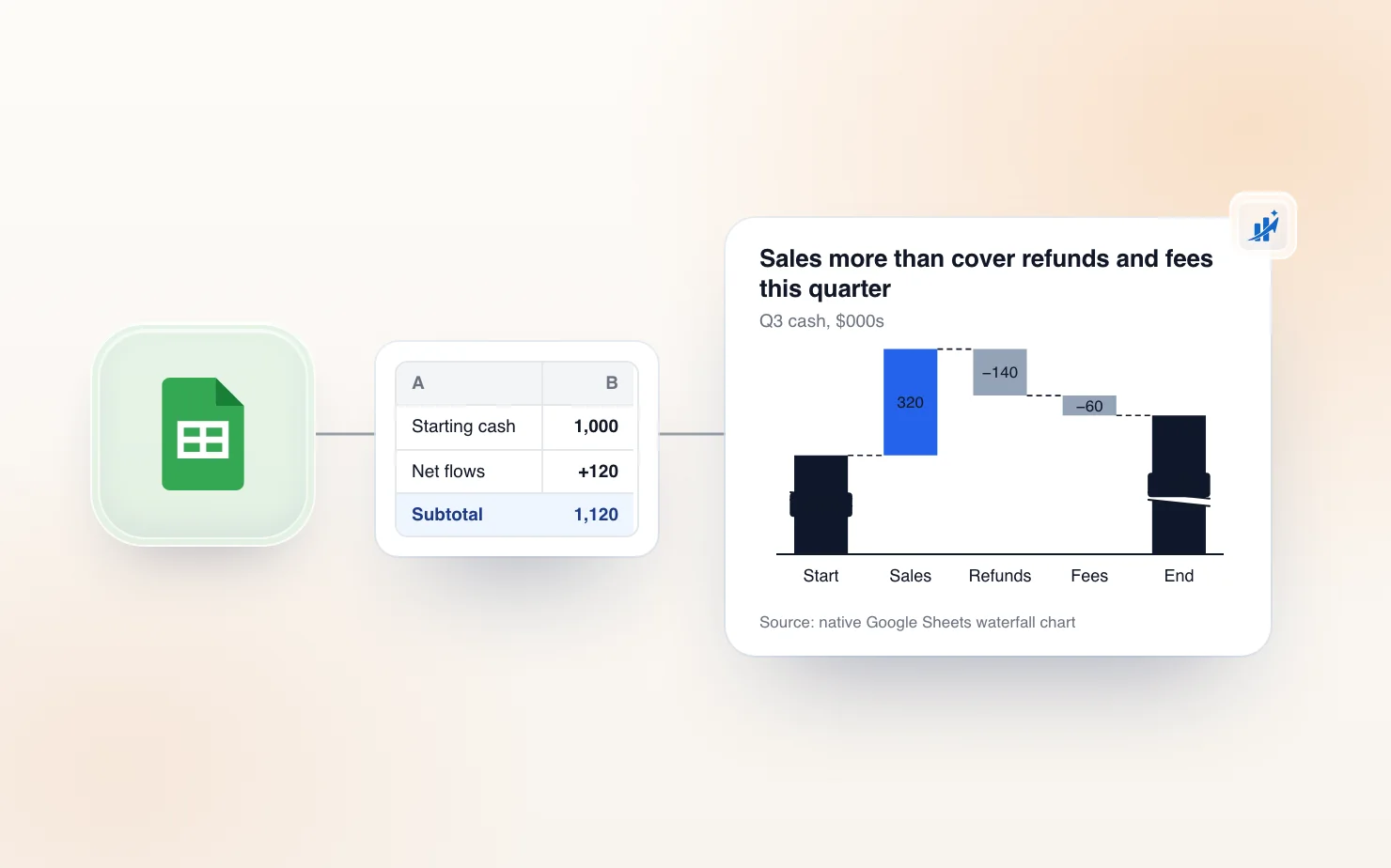
A waterfall chart shows how a starting number becomes an ending number through a series of gains and losses — revenue to revenue, cash to cash, headcount to headcount. Google Sheets has had a genuinely capable native waterfall chart type since late 2017, and it's better than most guides give it credit for. By the end of this one you'll have a working chart, subtotals that say what you want them to say, and a clear-eyed view of where Sheets' limits actually bite once the chart has to go in front of people.
What you're building: anatomy of a waterfall chart
Every waterfall is made of four kinds of bars. A start bar rises from zero to your opening figure. Increase bars float upward from wherever the running total currently sits. Decrease bars float downward from the same running total. And subtotal bars drop all the way back to the baseline, anchoring the story at the end (and optionally partway through).
One concept most step-by-step guides skip, and the single biggest source of broken charts: row order in your data is bar order in your chart. Sheets computes the running total top to bottom, so a misplaced row doesn't just look wrong — it makes every bar after it start from the wrong height, and it's the most common reason a subtotal ends up showing 0. Get the rows in narrative order before you touch the chart editor.
(Working across tools? Here's how native waterfall support compares across Excel, PowerPoint, and Google Slides — Sheets holds up better than you'd expect.)
Set up your data first
Sheets expects a specific, simple shape — and if you give it that shape, the chart works on the first try:
- Labels in column A, one row per bar, in the order you want the bars to appear.
- Values in column B — increases as positive numbers, decreases as negative numbers. There is no separate "type" column; the sign of the number is the type.
- The first row is your starting total, not a change. Sheets draws it from zero, so enter the full opening figure (1,000), not a delta.
- Don't add an ending-total row. Sheets appends a gray subtotal bar at the end automatically, computed from your data. If you type the ending figure in as a row, it gets treated as one more change and your chart ends roughly double where it should.
That last point trips up more people than everything else combined. The ending bar is derived, not entered.
A minimal example table
Copy this into a blank sheet to follow along:
| A | B | |
|---|---|---|
| 1 | Starting revenue | 1000 |
| 2 | New customers | 240 |
| 3 | Churn | -180 |
| 4 | Upsell | 90 |
Four rows in, five bars out — Sheets adds the gray ending bar itself, labeled "Subtotal," showing 1,150. Renaming it to something useful like "Ending revenue" is covered below, and it's a two-click fix that no other guide documents.
Sequential vs. stacked data — pick before you build
"Stacked waterfall chart" means two different things in the wild, and it's worth one sentence to untangle them. If you mean splitting each bar into sub-components — say, breaking "New customers" into EMEA and Americas — that's the native Stacking: Stacked option, and you get it by adding one value column per component (B for EMEA, C for Americas) and flipping a dropdown in the Setup tab. If you mean the old manual trick of faking floating bars with a stacked column chart and a transparent base series — the method every pre-2017 tutorial teaches — you don't need it anymore. The native waterfall type does the floating for you. Nobody should be maintaining invisible-base formulas in 2026.
Build the native waterfall chart (step by step)
With the data shaped as above, the build is four clicks:
- Select your range, including the label column (A1:B4 in the example).
- Insert → Chart. Sheets drops in a chart and opens the Chart editor on the right.
- In the editor's Setup tab, open the Chart type dropdown.
- Scroll down to the Other section and choose Waterfall.
That's it. Sheets auto-detects which column holds labels and which holds values, floats the increases and decreases, and appends the gray subtotal bar. If your data followed the shape in the previous section, the chart is correct on the first render — the remaining work is formatting, not fixing.
If Sheets picks the wrong rows or columns
Occasionally Sheets guesses wrong about which direction your data runs — you get one bar per series instead of one bar per row, or labels end up as values. The fix is one checkbox: in the Setup tab, toggle Switch rows/columns. If labels are being treated as data, also check Use column A as labels in the same tab.
Format it: colors, labels, and the subtotal bar
This is where the native chart earns its keep — and where most guides stop just as it gets useful. Everything below lives in the Customize tab of the Chart editor (double-click the chart to reopen it).
Positive, negative, and subtotal colors
Open Customize → Series. Sheets styles waterfall bars by type — one fill for increases, one for decreases, one for subtotals — and defaults to a blue/red/gray scheme that reads as "default Google chart" from across the room. Each type has its own fill color, line color, and line thickness controls. For anything client-facing, this is the first thing to change: pick your increase and decrease colors from the brand palette and mute the subtotal bars to a neutral so the changes, not the anchors, carry the color.
How to rename or add a custom subtotal label
The auto-generated ending bar arrives labeled "Subtotal" — which is almost never what the bar actually is. Here's the exact path to fix it, since Google's own docs bury it:
- Double-click the chart to open the Chart editor.
- Go to the Customize tab → Series.
- Click the Custom subtotal label text box.
- Type the name you want — "Ending ARR," "FY25 cash," "Net headcount" — and the bar's axis label updates immediately.
To add an intermediate subtotal partway through the chart — a "Gross profit" anchor in the middle of a P&L walk, say — use Add new subtotal in the same Series panel, choose the data point it should follow, and give it its own label. Intermediate subtotals drop to the baseline just like the ending bar, which is exactly what a mid-walk anchor should do.
Connector lines and chart style
The thin lines linking each bar to the next live under Customize → Chart style. You can change their color, style, and whether they show at all — and that's the full extent of it. There's no per-segment control: you can't connect only some bars, thicken one connector for emphasis, or style the line into an arrow. On is on, off is off, for every bar at once.
Data labels
Under Customize → Series, tick Data labels to print each bar's value on the chart, with font and position controls alongside. The practical ceiling arrives fast: you get one label per bar. Showing the value and the percent change on the same bar — the standard finance formatting — isn't supported, and the usual workaround (concatenating both into a helper column of text) breaks the numeric chart. For an internal review chart, the value alone is fine. Keep this limit in mind for later.
Handling negative values and mid-chart drops
Older tutorials — written for the pre-2017 manual method — walk you through MIN/MAX helper formulas to position bars that dip below the running total. With the native chart type, you don't need any of it. Enter decreases as negative numbers and Sheets positions the floating bars correctly, including several negatives in a row and a running total that trends downward for most of the chart.
The one edge case still worth attention: a single bar large enough to swing the running total across zero — a loss that takes cumulative cash from +50 to −30, say. Sheets renders it correctly (the bar straddles the axis), but straddling bars read ambiguously at presentation distance, and audiences reliably misjudge where the total landed. Before presenting, zoom out and check any bar that crosses the axis; if it muddles the story, split the step into two rows ("Restructuring, to break-even" and "Restructuring, below break-even") so the crossing is explicit.
Common problems and fixes
Subtotal bar shows 0 or disappears
The most-reported waterfall problem in Google's own support community, and it's almost never a chart bug — it's the data. The running total breaks when any cell in the range isn't a real number: a formula returning "" instead of 0, a value stored as text (left-aligned in its cell is the tell), or a chart range that stops one row short. Check the column with ISNUMBER, replace blank-returning formulas with 0, and re-select the full range in the Setup tab. The subtotal comes back the moment every input is numeric.
Bars are in the wrong order or the axis looks flipped
The chart mirrors your sheet, so re-sort the source rows into narrative order — the chart follows instantly. If the whole chart looks transposed (series where categories should be), it's the Switch rows/columns checkbox in the Setup tab, covered above.
I can't color one specific bar differently from the rest of its series
You can't — and it's a real limit, not a missing menu. Sheets colors waterfall bars by type (increase, decrease, subtotal), never individually. The classic consulting move of spotlighting one bar — the churn bar, in the brand's accent color, with everything else muted — has no native path. If that's the chart you need, it's the clearest sign you've hit the ceiling of the tool, which brings us to the honest part.
When the native chart isn't enough — and what to do about it
Credit where due: for internal analysis, a quick sanity check, or a chart that lives its whole life inside the spreadsheet, the native Sheets waterfall is genuinely good. Correct mechanics, automatic subtotals, honest handling of negatives. Use it freely.
Where it runs out is the moment the chart has to face stakeholders. Three walls, in ascending order of pain:
- Brand styling. Fonts, exact palette colors, label formatting to match the deck — Sheets gets you to "close-ish," and close-ish is what makes a slide read as pasted-in.
- Per-bar emphasis. As covered above, there's no way to style one call-out bar differently from its series — the single most common ask in a board or client chart.
- The deck itself. This is the big one. The moment the waterfall leaves Sheets for a presentation, it's either a screenshot — dead the instant a number changes — or a linked Sheets chart with an Update button and all of the styling limits above, now permanent.
That last gap is covered end to end — including the native Slides options and the stacked-column workaround — in our full guide to waterfall charts in Google Slides.
It's also exactly the gap ChartKit's waterfall chart tool exists to close. ChartKit is a Chrome extension that builds the waterfall natively inside Google Slides and keeps it synced to the same Sheet — with real per-bar formatting, the call-out bar, brand palettes, and the value-plus-delta labels Sheets can't do. Free for 10 charts a month; Pro is €10/month for unlimited. No hard sell: if your waterfall stays in the spreadsheet, you don't need it. If it goes in a deck every month, you do.
FAQ
How do I create a waterfall chart in Google Sheets? Put labels in one column and values in the next — increases positive, decreases negative — select the range, then Insert → Chart. In the Chart editor's Setup tab, open the Chart type dropdown, scroll to Other, and choose Waterfall. Sheets floats the bars and adds the ending subtotal automatically.
How do I change the subtotal label in a Google Sheets waterfall chart? Double-click the chart, go to Customize → Series, click the Custom subtotal label text box, and type the new name. To add an intermediate subtotal partway through the chart, click Add new subtotal in the same panel and label it there.
Can I make a stacked waterfall chart in Google Sheets? Yes — add a second value column and set Stacking to Stacked in the Setup tab, which splits each bar into stacked segments. That's different from the old manual stacked-column-chart trick, which the native waterfall type made obsolete.
Why does my waterfall chart's subtotal show 0 or not appear?
It's almost always the data, not the chart — a formula returning blank or text instead of a number breaks the running total. Check every value with ISNUMBER, replace blanks with 0, and make sure the chart's range covers every row.
Does Google Sheets handle negative values automatically in a waterfall chart? Yes — decreases entered as negative numbers position themselves correctly, no helper formulas required. The one case worth a visual check is a bar big enough to swing the running total across zero, which renders correctly but can read ambiguously.
How do I keep a Google Sheets waterfall chart up to date in a presentation? A Sheets chart embedded in Slides can be refreshed with the Update button, but the styling and per-bar limits come along with it. ChartKit's waterfall chart tool builds the chart natively in Slides and keeps it synced to your Sheet — free for 10 charts a month.
Build the chart in Sheets today — it's a good chart. And when it graduates to the board deck, build it once in the deck and let it stay current.
Download and try ChartKit for free — 10 charts a month on the Free plan, no card required.