
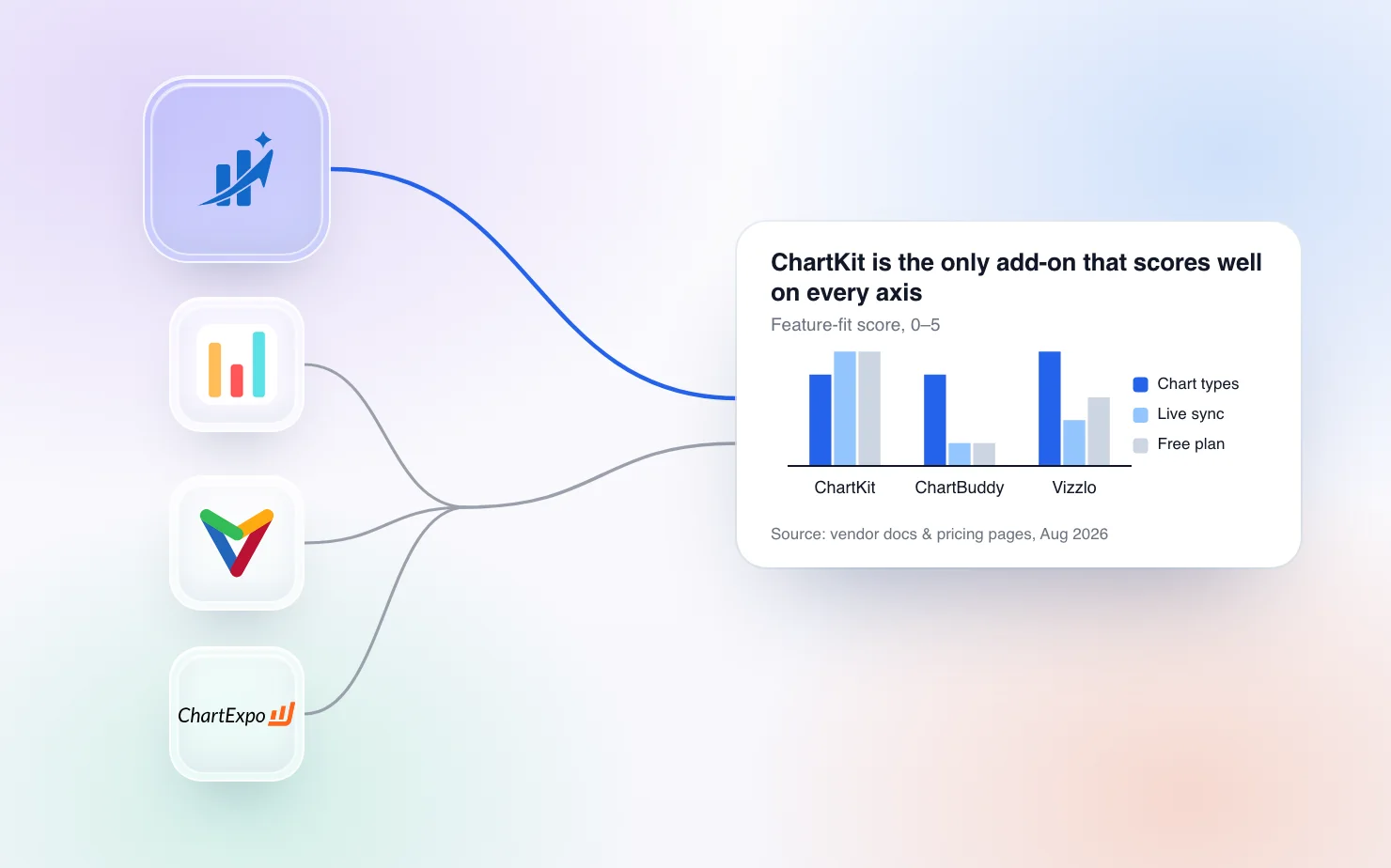
Google Slides' native chart tool is a thin wrapper around Google Sheets charts — bar, column, line, and pie, and that's it. Anyone building consultant- or finance-grade decks hits the wall fast, usually at the first waterfall, Mekko, or Gantt, and starts searching for a chart extension that fills the gap. This roundup compares every real chart creation tool for Google Slides — not AI deck builders, not icon packs — on the three things that decide the choice: chart types, live Google Sheets sync, and price.
Two disclosures up front. ChartKit is one of the seven tools, and we build it — pricing and feature claims below come from each vendor's own pages as of August 2026, and we've marked what we couldn't verify. And if your shopping list is broader than charts — diagrams, fonts, data pulls — start with our broader add-on roundup for consultants and finance teams instead; this post goes deep on charts only.
What actually counts as a "chart add-on" for Google Slides
The line this post draws is simple — does the tool let you build and edit a chart inside the Slides editing surface, or do you build it somewhere else and paste in an image? The first kind survives a data update the night before the meeting; the second kind quietly becomes a screenshot workflow. You'll see the distinction running through the whole comparison (browse every chart type ChartKit supports for what "inside Slides" looks like in practice).
Two boundary calls. Lucidchart is included even though it's a diagram tool, not a chart tool — it tops every generic "best Slides add-ons" list, so you deserve a straight answer on it. AI deck generators like Plus AI and Beautiful.ai are excluded — they do a different job (generating whole decks, not building individual charts), which is why they belong in the broader roundup, not here.
The 7 tools compared
Here's the full table — chart-type columns cover the four consultant-grade types that actually separate these tools; all of the first four also handle the standard set (stacked bar, line, pie, scatter). For the deepest head-to-head between the two Slides-native tools, see ChartKit vs ChartBuddy.
| Tool | Native in Slides | Live Sheets sync | Waterfall | Mekko | Gantt | Harvey balls | Free plan | Paid price | Platform |
|---|---|---|---|---|---|---|---|---|---|
| ChartKit | ✅ In-editor | ✅ Auto-refresh | ✅ | ✅ | Rolling out | ✅ | 10 charts/mo, no card | €10/mo (€80/yr) | Chrome extension (Slides, Docs, Sheets) |
| ChartBuddy | ✅ In-editor | ❌ | ✅ | ✅ | ✅ | ❌ | Trial only | ~€10/mo | Google Slides add-on |
| Vizzlo | Partial — own app, insert | Refresh via Vizzlo's editor | ✅ | ✅ | ✅ | ✅ | Free w/ watermark | From $15/user/mo | Web app + Slides add-on |
| ChartExpo | ❌ Build in Sheets, paste | Manual re-export | ✅ | — | ✅ | — | 7-day trial only | ~$10/user/mo | Google Sheets / Excel add-on |
| ExtraChart | Sidebar add-on, inserts image | ❌ | — | — | — | — | — | Pricing not published | Google Workspace add-on |
| Native Sheets-linked charts | Partial — linked from Sheets | Manual "Update" click | Basic | ❌ | ❌ | ❌ | Free | Free | Built into Slides + Sheets |
| Lucidchart | ❌ Insert as image | ❌ | ❌ | ❌ | ❌ | ❌ | Limited free tier | From ~$9/mo | Web app + add-on |
A "—" means the vendor doesn't document the feature at the time of writing — for ExtraChart in particular, neither the chart-type coverage nor the pricing is published clearly, so we've left those cells open rather than guess.
Chart-by-chart, who wins
The table tells you what exists; this section tells you what's actually good. One honest caveat per chart type, on purpose.
Waterfall charts
The chart that sends most people searching in the first place. ChartKit and ChartBuddy both build waterfall charts natively on the slide — subtotals, connectors, and labels included — and either will do the job; ChartKit adds axis breaks and a live Sheets connection on top. Vizzlo and ChartExpo can both produce a waterfall, but you build it in their own environment first and bring the result in. If you're coming from think-cell specifically, the think-cell alternatives comparison covers that migration in detail.
Mekko / Marimekko charts
The thinnest field of the four. Mekko charts are genuinely hard to render well, and only ChartKit, ChartBuddy, and Vizzlo offer one — the first two natively in Slides, Vizzlo in its own app. If market-map slides are your bread and butter, this row alone eliminates most of the table.
Gantt charts
The one category where the field flips. ChartBuddy is the established native option — a real Gantt inside Slides with the most mileage on it — and Vizzlo's is polished if you don't mind building outside Slides. ChartKit's Gantt chart — phases, freeze bands, milestones, and dependencies on a week or month axis, edited on the slide — is built and rolling out now, but it isn't enabled for everyone yet; if you need a Gantt today, ChartBuddy is the safer pick. The honest framing — all of these are communication-grade timelines for a roadmap slide, not project-management tools; if you need resource lanes and auto-scheduling, none of the seven is the answer.
Harvey balls / comparison matrices
A genuine ChartKit differentiator, stated plainly — ChartKit is the only tool here that renders a Harvey ball matrix natively in Slides, with ratings you type into a grid instead of circles you draw by hand. Vizzlo has a Harvey balls template in its own app. Everyone else leaves you stacking shapes manually, which breaks the moment a row is added.
Stacked bars, 100% bars, and the standard set
Table stakes. Stacked bar, 100% stacked, clustered bar, line, pie, and scatter are covered by every real chart tool here — including native Sheets-linked charts. The differentiation at this tier is polish, not availability — segment labels that don't overlap at small sizes, totals and deltas without hand-drawn text boxes, colors that match your template instead of the vendor's defaults. It's also where the native tool quietly loses — the charts exist, but the labelling and annotation options run out exactly where a management deck starts. Test with your ugliest real dataset, not the demo data.
Live Google Sheets sync — the feature most tools fake
"Connects to Google Sheets" appears on almost every landing page in this category, and it means three different things. True live sync means the chart re-renders in the deck when the source range changes — of these seven, only ChartKit does that (here's how the live connection works). Manual refresh is the native linked-chart model — Slides shows an Update button when the Sheet changes, someone has to click it on every chart, and the styling options remain the native tool's. And then there's refresh-in-their-app — Vizzlo and ChartExpo charts update when you reopen their editor and push the change across, which in practice means the deck is stale whenever you didn't. ChartBuddy, ExtraChart, and Lucidchart have no Sheets data link at all.
Why it matters — the failure mode isn't building the chart, it's the Thursday-night data update before a Friday review. With manual refresh, someone has to remember every linked chart in a 40-slide deck; with an image-paste workflow, someone has to rebuild. For recurring reporting, this one row of the table matters more than any chart-type checkmark.
Pricing side by side
Most of these charge per editor per month, and the spread is wide — but the more important split is what "free" means. ChartKit's free plan is 10 charts a month with every chart type and no card, permanently. Vizzlo's free tier is real but watermarks everything you export. ChartBuddy and ChartExpo offer trials only — after 7 days on ChartExpo, you pay or stop. Native Sheets-linked charts are the only fully free path, with all the limits covered above.
On paid plans — ChartKit is €10/month or €80/year (current pricing here), ChartBuddy around €10/month, ChartExpo around $10 per user per month, Vizzlo from $15 per user per month with team plans above that, and Lucidchart from about $9/month for diagramming. ExtraChart doesn't publish pricing — treat any figure you see quoted elsewhere with suspicion, because we couldn't verify one.
Best for X — quick verdicts
- Best free option — ChartKit. 10 charts a month, every chart type, no card. Nothing else here is free without a watermark.
- Widest chart library native in Slides — ChartBuddy. 15+ types edited in the sidebar, including funnel charts nobody else has natively.
- Most chart types overall — Vizzlo, if you don't need Slides-native editing. 100+ types including word clouds, radar, and SWOT layouts, built in its own polished editor.
- Analysts who live in Sheets and never want to click Update — ChartKit. The only true live sync in the table.
- Zero cost, zero installs, basics only — native Google Sheets-linked charts. Fine for a simple bar or line; the manual Update click is the tax.
- Diagrams and flowcharts — Lucidchart, with the caveat repeated: it's a diagram tool that appears in chart-tool searches, not a chart tool.
How we evaluated these
We tested the tools we could install directly and reviewed vendor documentation and pricing pages for the rest, checking chart-type claims against each vendor's own published chart galleries and verifying prices on vendor pricing pages during August 2026. Where something couldn't be verified — ExtraChart's pricing and full chart list — the table says so instead of guessing. ChartKit is the publisher of this comparison; that's exactly why the table gives no visual favors and why four of the six verdicts above aren't us. We'll revisit this post when vendors change their plans.
FAQ
What's the best free chart add-on for Google Slides? ChartKit — 10 charts a month with every chart type, no credit card. The monthly cap is the honest caveat; heavy users will hit it. Vizzlo's free-with-watermark tier is the alternative if the watermark doesn't bother you.
Can I add a waterfall or Mekko chart to Google Slides without think-cell? Yes. ChartKit and ChartBuddy both build waterfalls and Mekkos natively inside Slides. If you're migrating a think-cell workflow wholesale, the think-cell alternatives guide walks through the options in more depth.
Does any Google Slides chart tool sync live with Google Sheets? Native linked charts need a manual Update click per chart, per change. ChartKit is the only tool of the seven where a connected chart re-renders automatically; Vizzlo and ChartExpo refresh when you push an update from their own editor.
What's the difference between a Chrome extension and a Google Workspace add-on? A Workspace add-on runs in a sandboxed sidebar; a Chrome extension runs in the browser and can integrate more deeply with the editor. Neither is automatically better or safer — the practical difference is the permission model, so review what each tool actually requests at install.
Is Vizzlo or ChartExpo better for Google Slides? For most Slides users, Vizzlo — bigger library, more design polish, and a Slides add-on for inserting your charts. ChartExpo is the right call if your team already standardises on it for Sheets or Excel reporting. Neither edits natively on the slide.
How much do Google Slides chart add-ons cost? Free to roughly $15 per user per month — the pricing section above has the tool-by-tool figures. The free-plan structure (real free tier vs. watermark vs. trial-only) matters more than a euro or two of monthly difference.
Related reading
If this table narrowed you down to the two Slides-native tools, the ChartKit vs ChartBuddy head-to-head goes feature by feature in the depth a seven-way roundup can't, and the ChartKit vs Vizzlo head-to-head does the same for the build-outside-insert-in question. And if charts are only part of your shopping list, the broader add-on roundup for consultants and finance teams covers diagrams, icons, data connectors, and formatting tools alongside the chart picks.
The fastest way to settle it, though, is still the same as ever — take the chart you rebuild most often and build it in the two or three candidates that survived the table.
Download and try ChartKit for free — 10 charts a month on the Free plan, no card required.